ABOUT
SERVICES
PROCESS
WORK
SHOP
CONTACT
HOME
FAQ
Replies within 24 hours
hello@renbarkevics.com
Copy
Copy component
Copied
[DETAILED PROJECTS]
In-depth brand work showing strategy, creative thinking, and real outcomes across different projects.
Converge
/
Brand & Campaign
BT Power
Brand System
IPS Cash
Marketing Materials
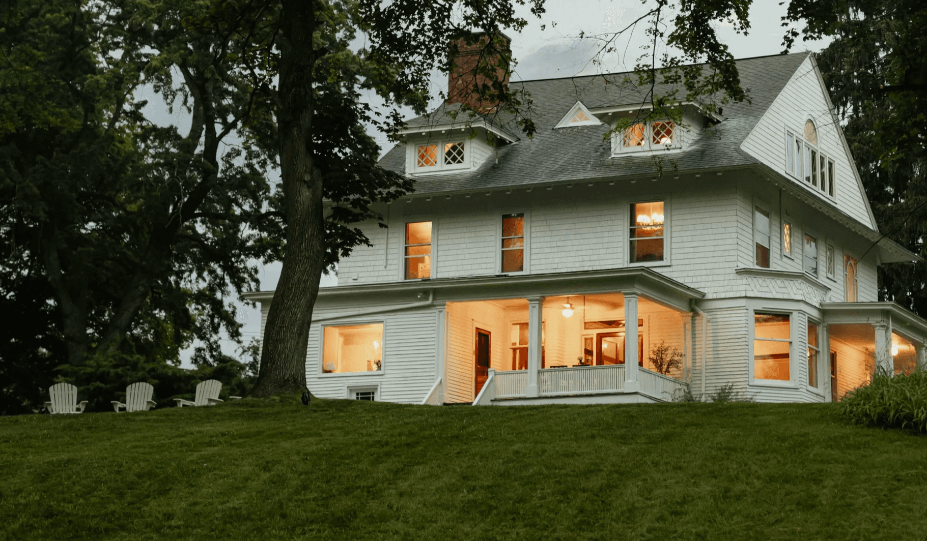
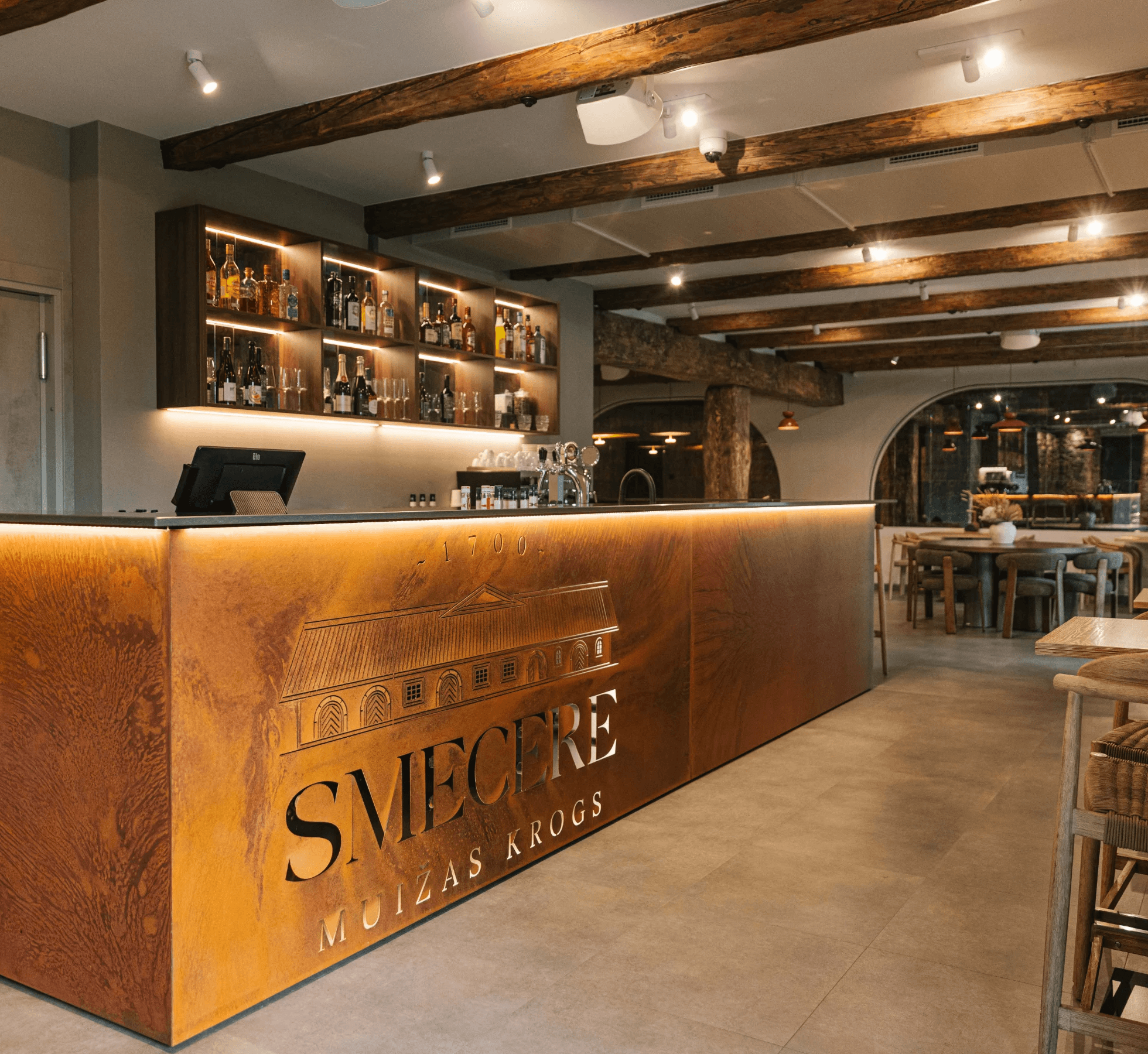
Smecere Manor Tavern
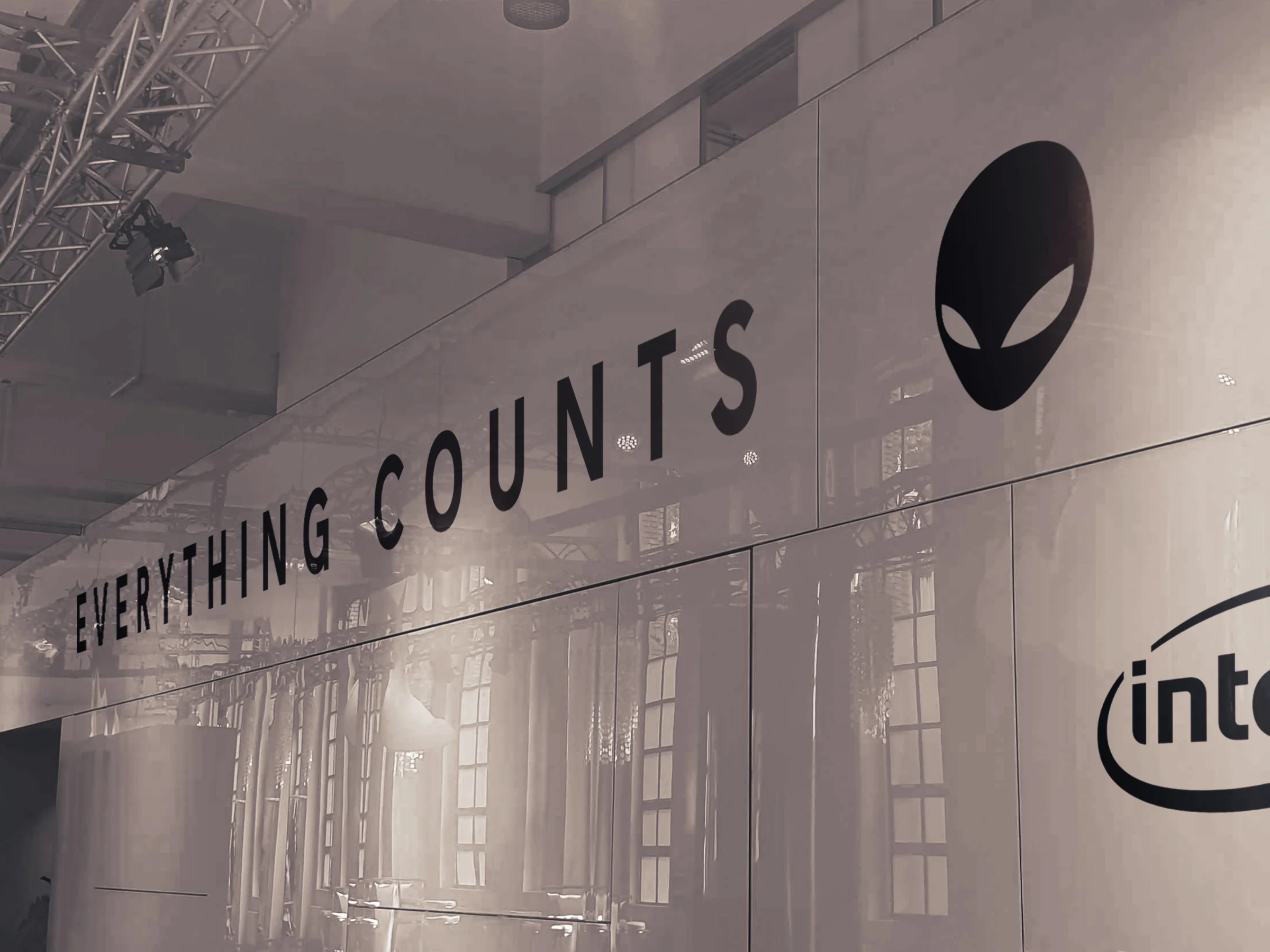
Alienware
Exhibition Booths
PowerFlow Trade
Visual Identity
[LOGOS]
A collection of logo marks, wordmarks, and symbols, hover or tap for brief context.
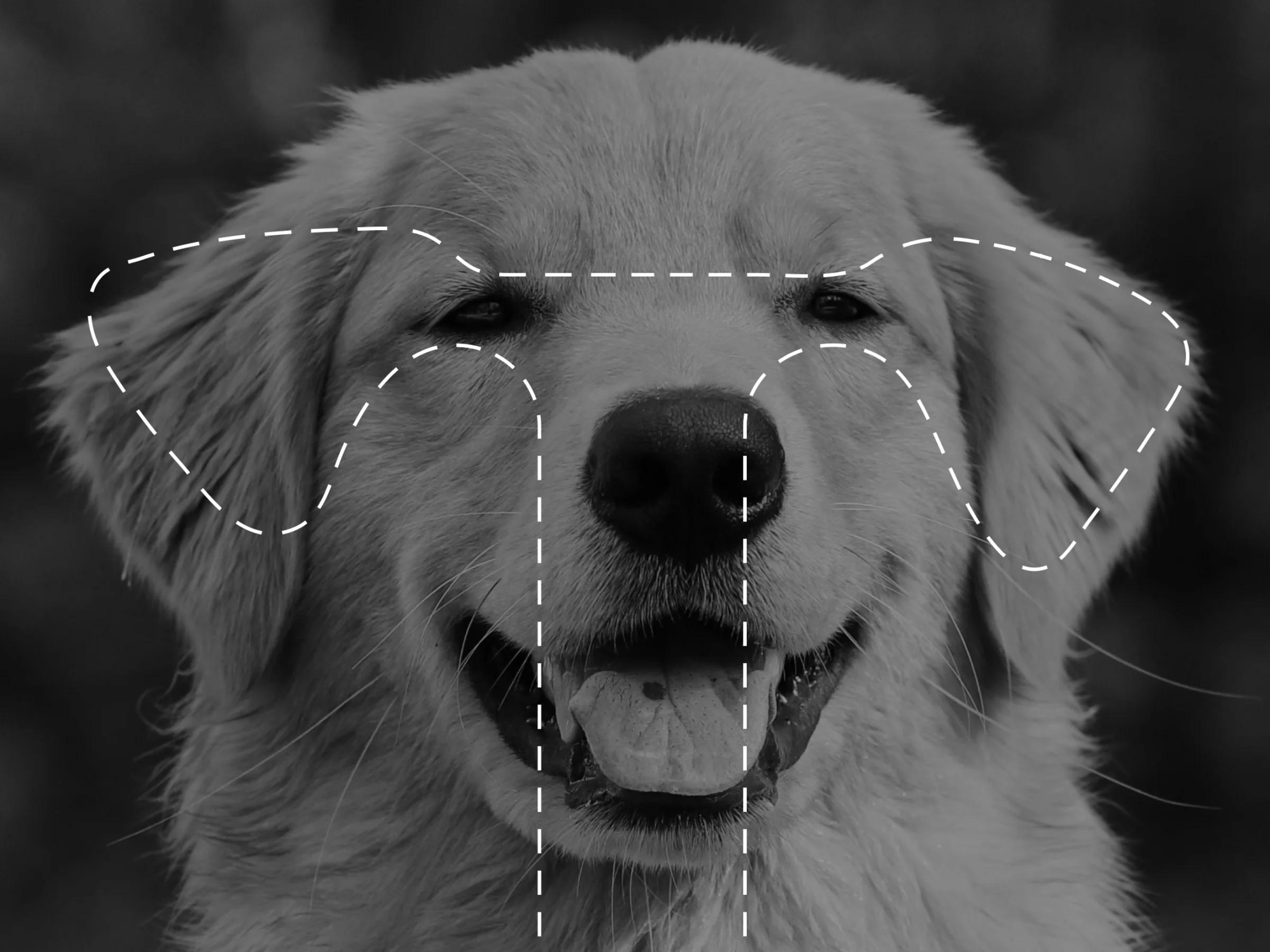
Passion project • Toodles — A warm, memorable wordmark with a dog-ear detail that gives a simple name an instantly recognisable character.
Passion project • Toodles — The symbol translates the playful character into a compact mark designed to work at every size.
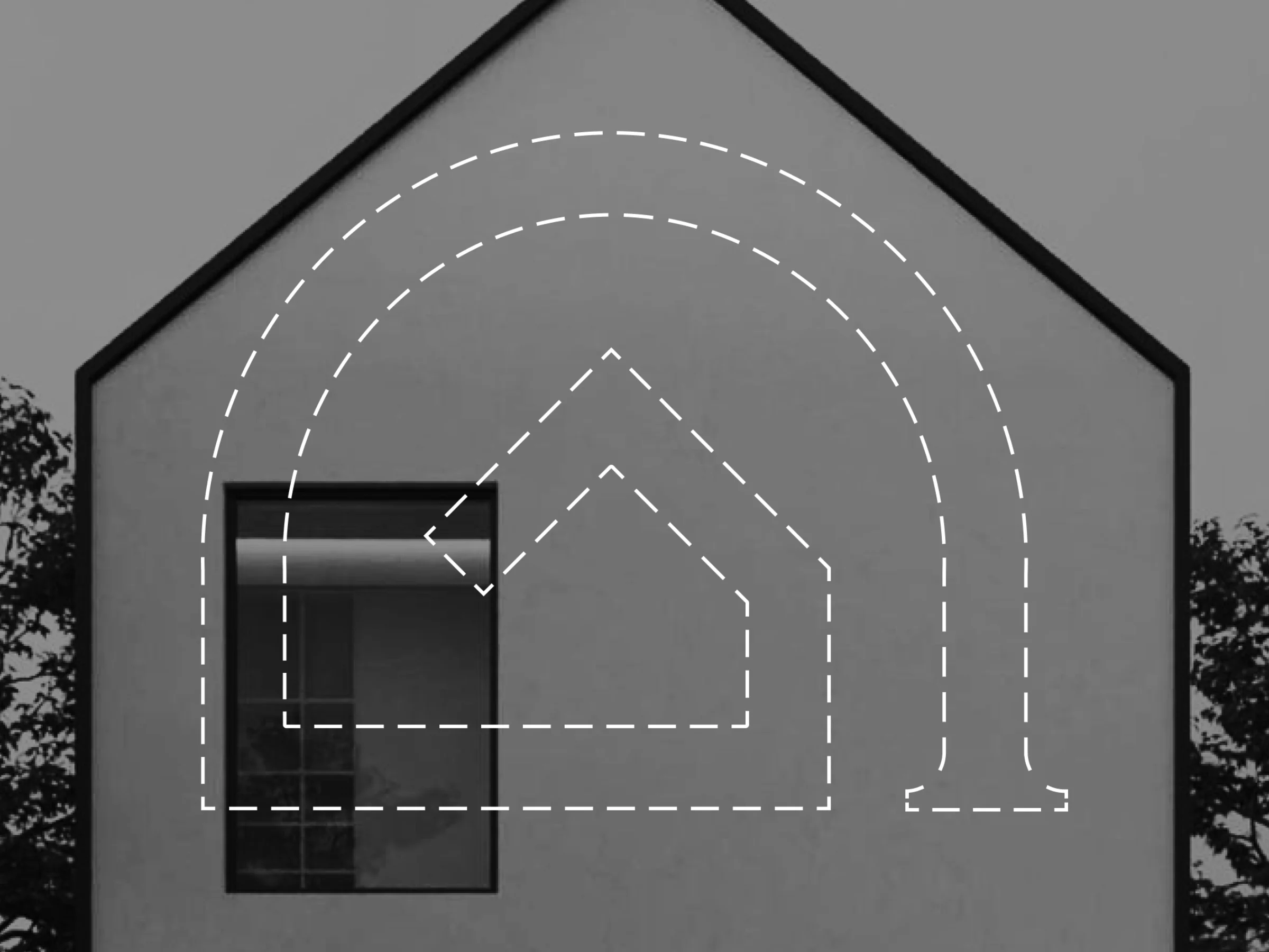
Client work • Golden Builders — An abstract G shaped as a home, giving a local construction studio a confident, ownable signature.
Client work • Golden Builders — The identity turns the brand’s structural expertise into a clear visual cue that builds trust before the first conversation.
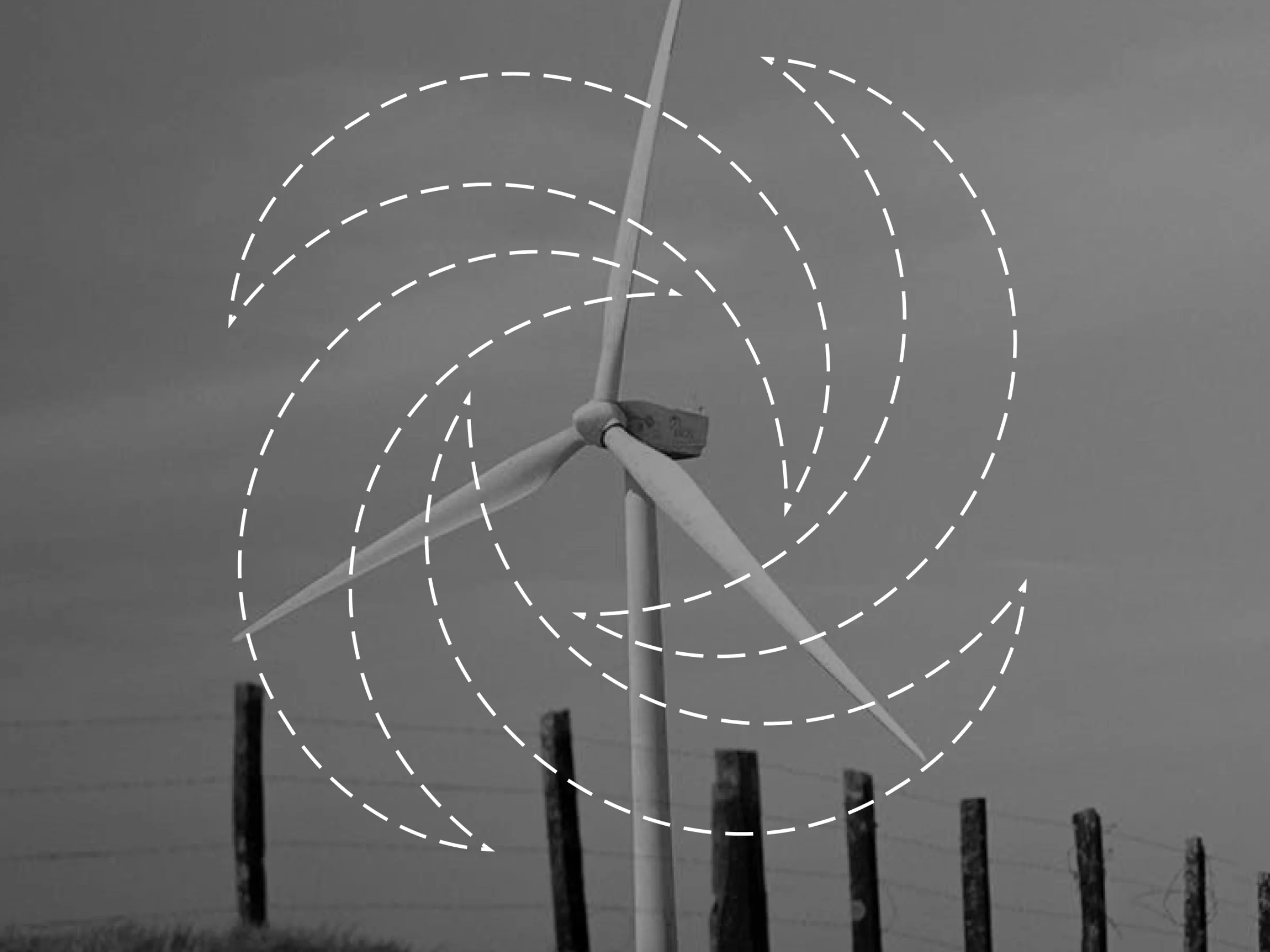
Client work • PowerFlow Trade — A clean energy mark designed to feel technical, credible, and ready for a fast-moving market.
Client work • PowerFlow Trade — The circular energy form gives the brand a distinctive signal of momentum, intelligence, and renewable ambition.
Client work • Aquatherm — A compact emblem that brings clarity and confidence to a specialist heating and water-systems business.
Client work • Aquatherm — A precise wordmark built to look at home on technical documents, signage, and product-led communications.
Client work • Yap — A bold school wordmark created to feel approachable for learners and unmistakable in a crowded local market.
Client work • Yap — A flexible lockup that keeps the school’s voice clear across every classroom, campaign, and social post.
Client work • Smecere Manor Tavern — A heritage-inspired crest that gives a historic destination the confidence to welcome a new audience.
Client work • Smecere Manor Tavern — The complete lockup balances historic character with the clarity needed for modern hospitality touchpoints.
Client work • DEVI by Danfoss — A local refresh that aligned a growing franchise with the updated European brand system.
Client work • Valencia Tennis Academy — A refined mark designed to feel disciplined, premium, and easy to apply across kit and club materials.
Client work • Meridian — A pub wordmark that makes heritage, warmth, and local character feel instantly tangible.
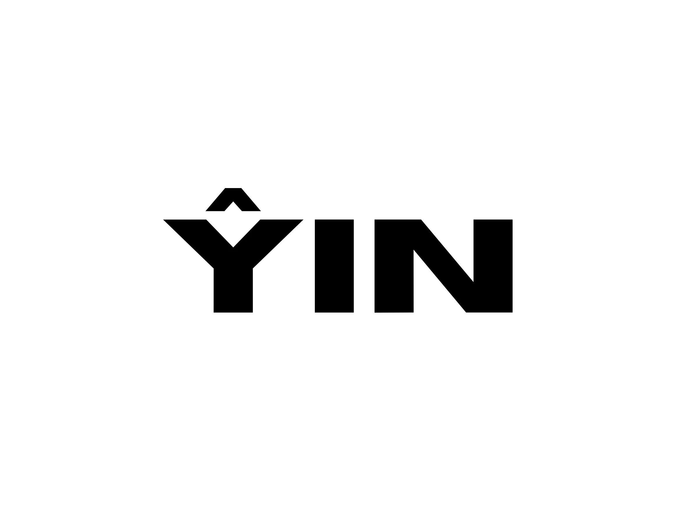
Client work • YIN — A minimal studio wordmark that keeps the brand calm, confident, and easy to recognise in a creative scene.
[HIGHLIGHTS]
A curated selection of visuals from projects and explorations, hover or tap for brief context.
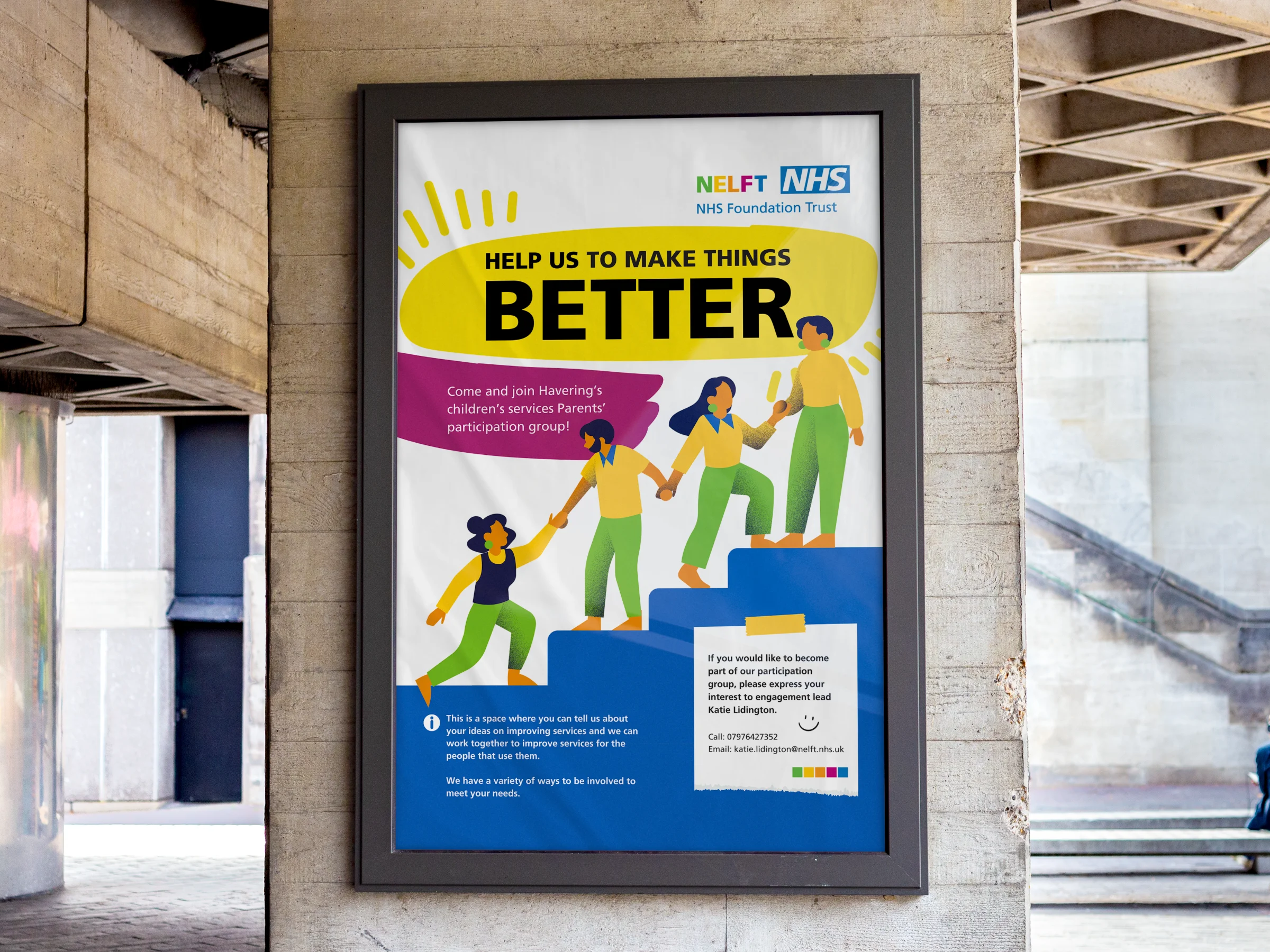
Client work • NELFT NHS — A clear public-facing poster designed to help families feel invited into improving local health services.
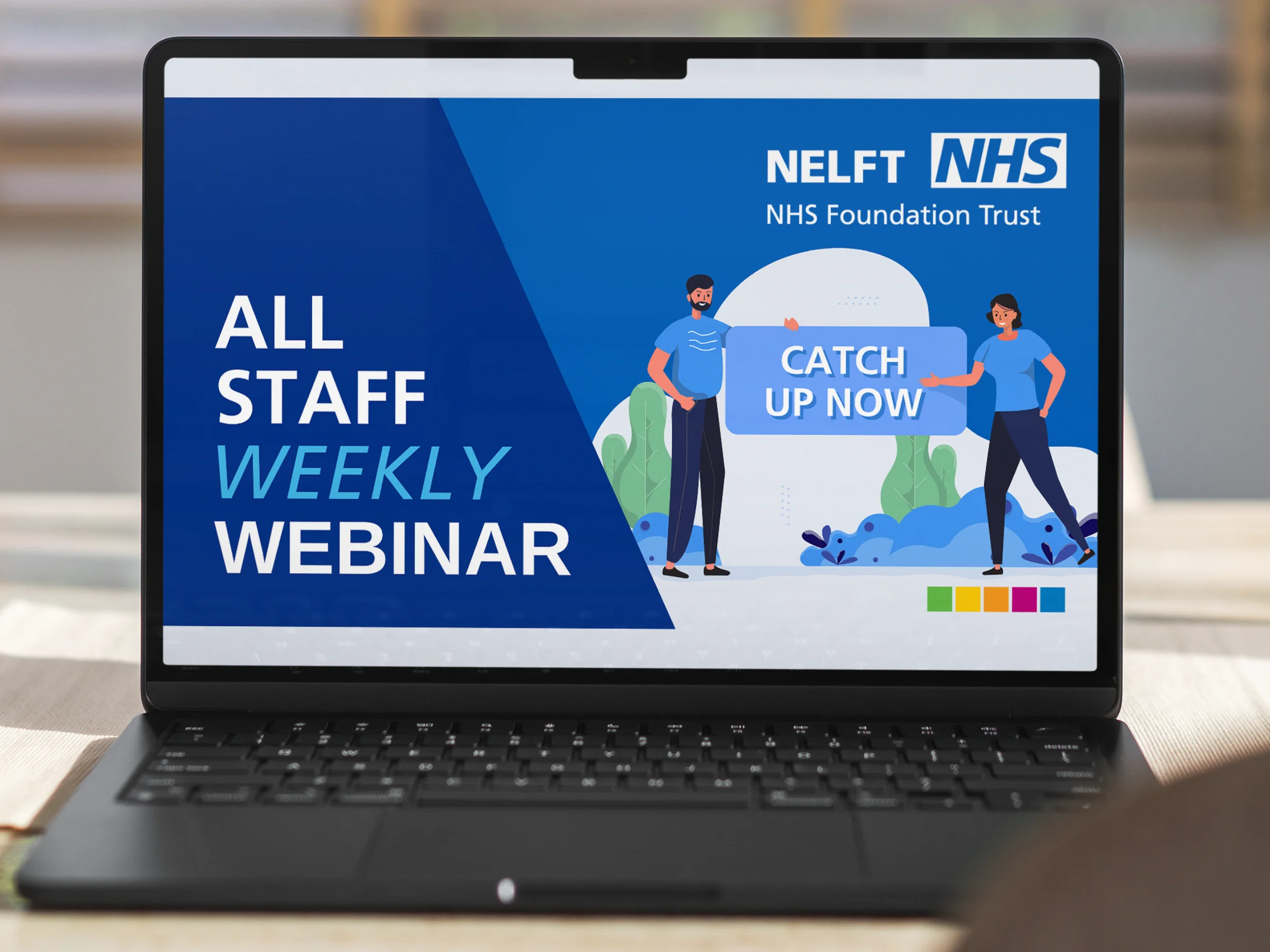
Client work • NELFT NHS — A consistent webinar thumbnail system that makes internal updates easier to spot, trust, and engage with.
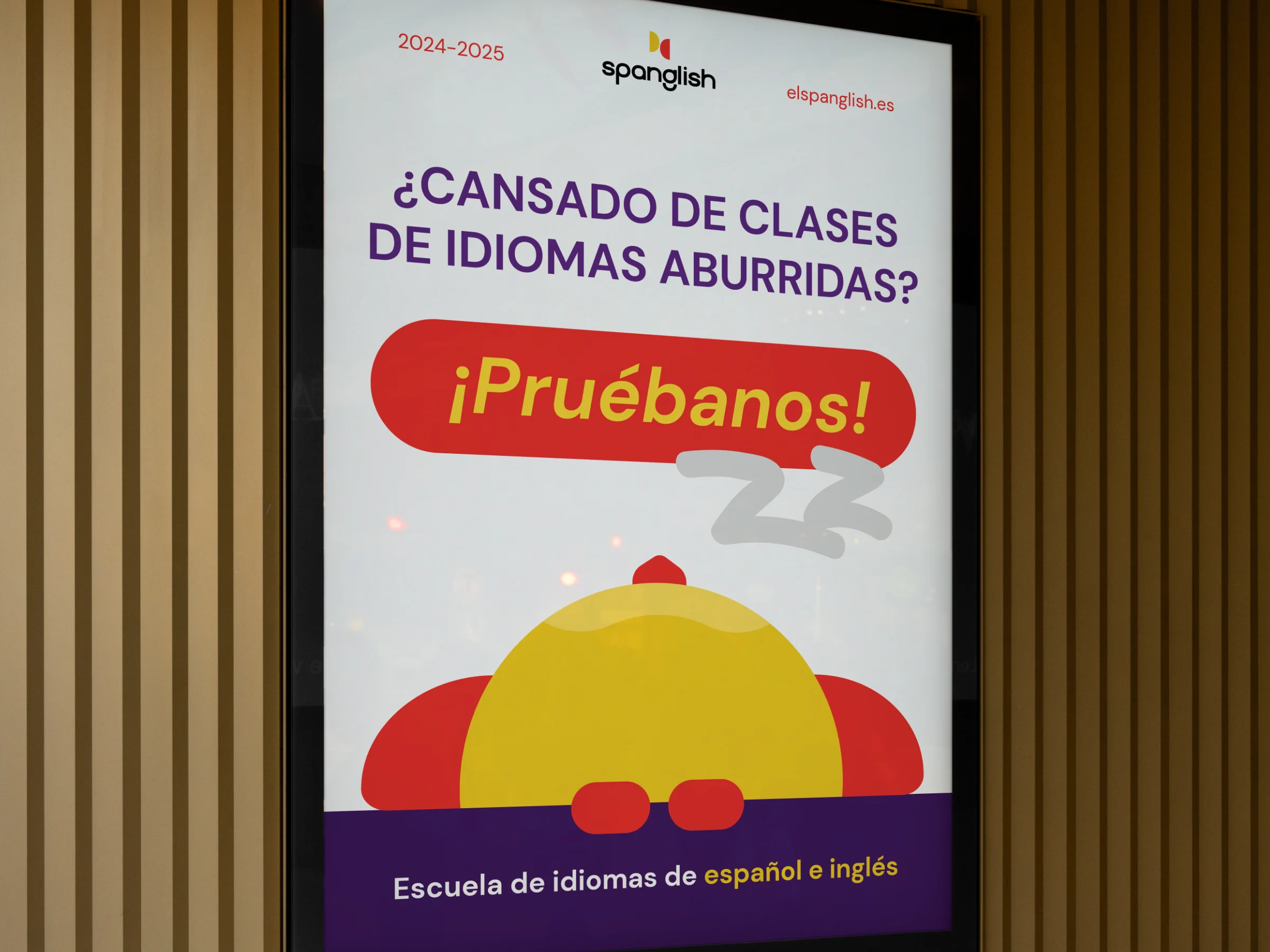
Client work • Spanglish — A bold campaign poster designed to turn language-learning curiosity into sign-ups.
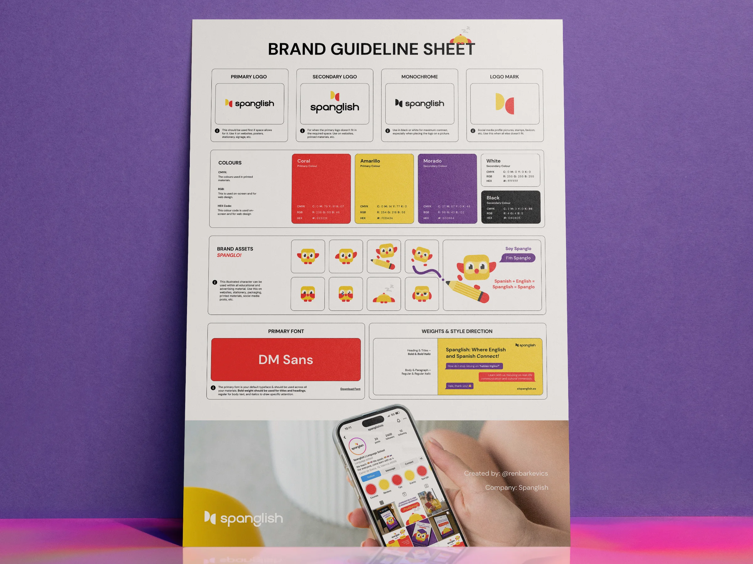
Client work • Spanglish — A practical guideline sheet that gives the team the confidence to use their brand consistently.
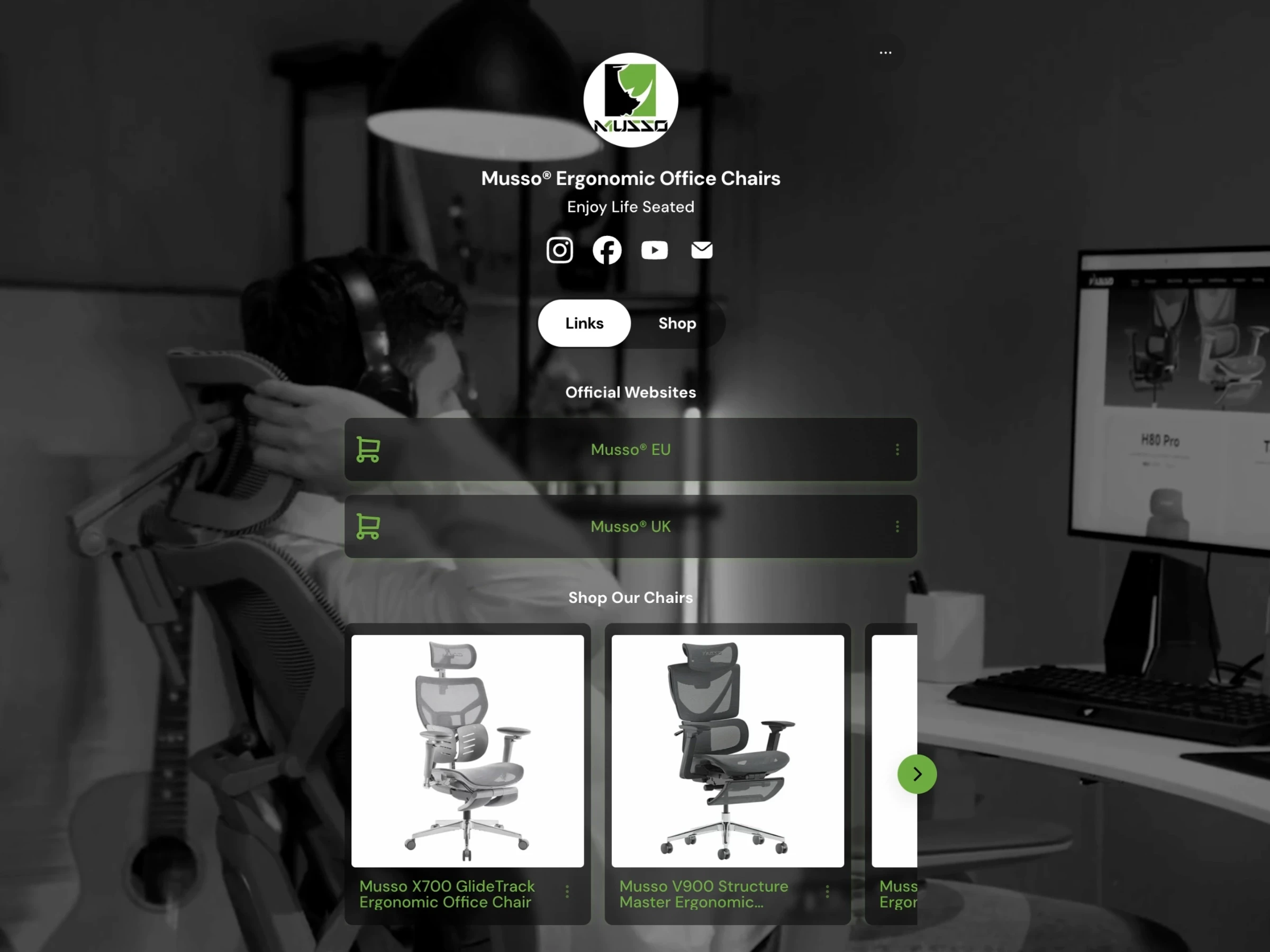
Client work • Musso — A streamlined link hub that turns social attention into a clearer route to products and purchase.
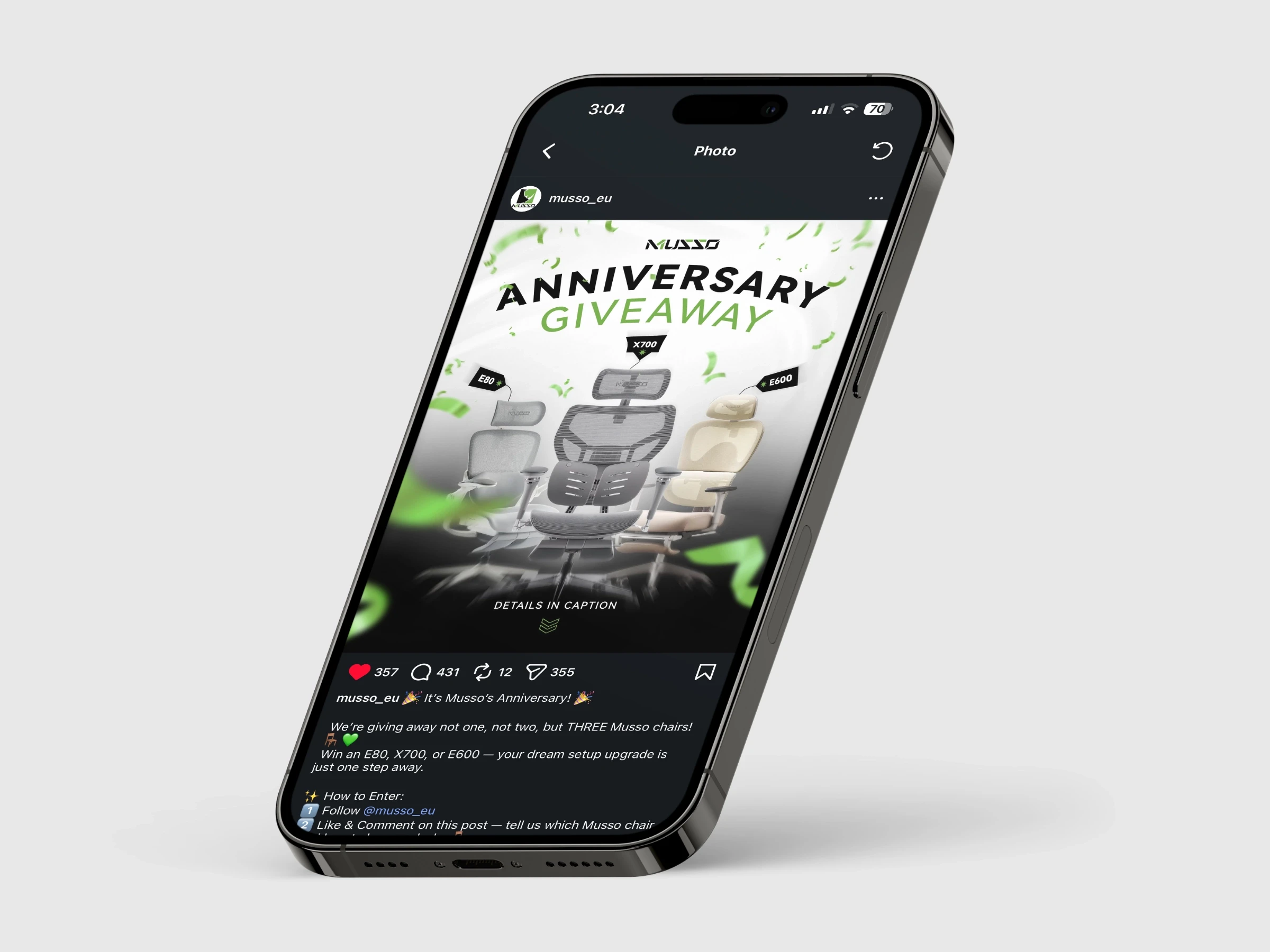
Client work • Musso — A giveaway visual built to make a product moment feel energetic, on-brand, and worth sharing.
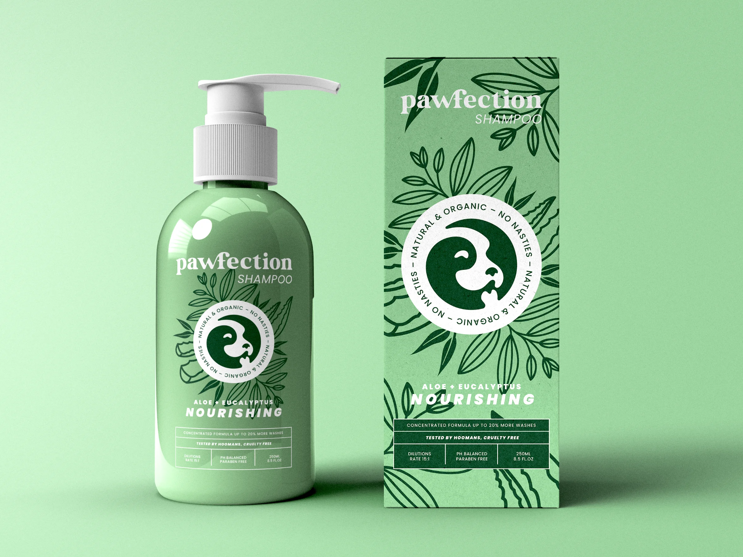
Passion project • Pawfection — Packaging designed to make a natural dog-care product feel considered, friendly, and shelf-ready.
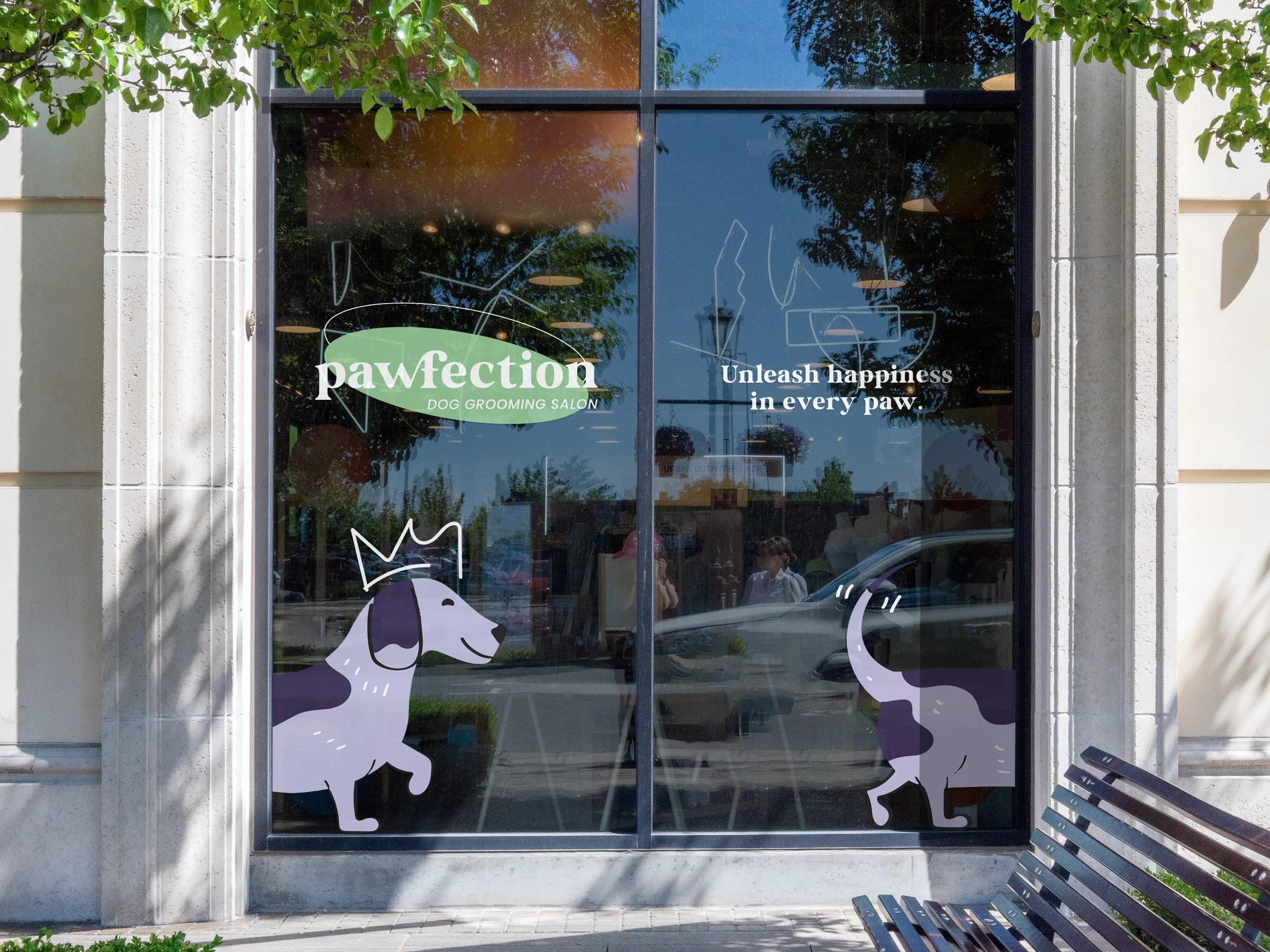
Passion project • Pawfection — A playful wordmark and illustration system created to give an everyday product a distinctive personality.
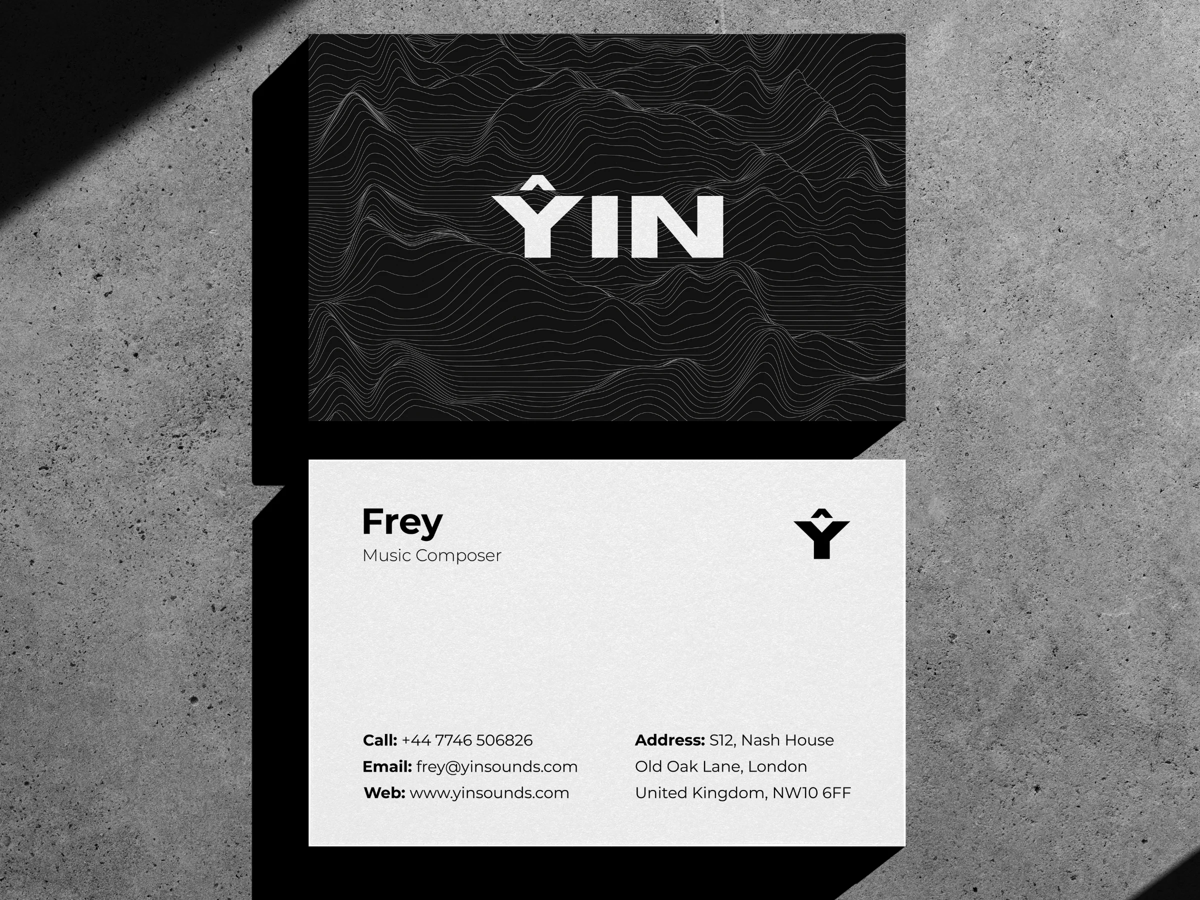
Client work • YIN — A business card system that brings a music studio’s quiet confidence into every introduction.
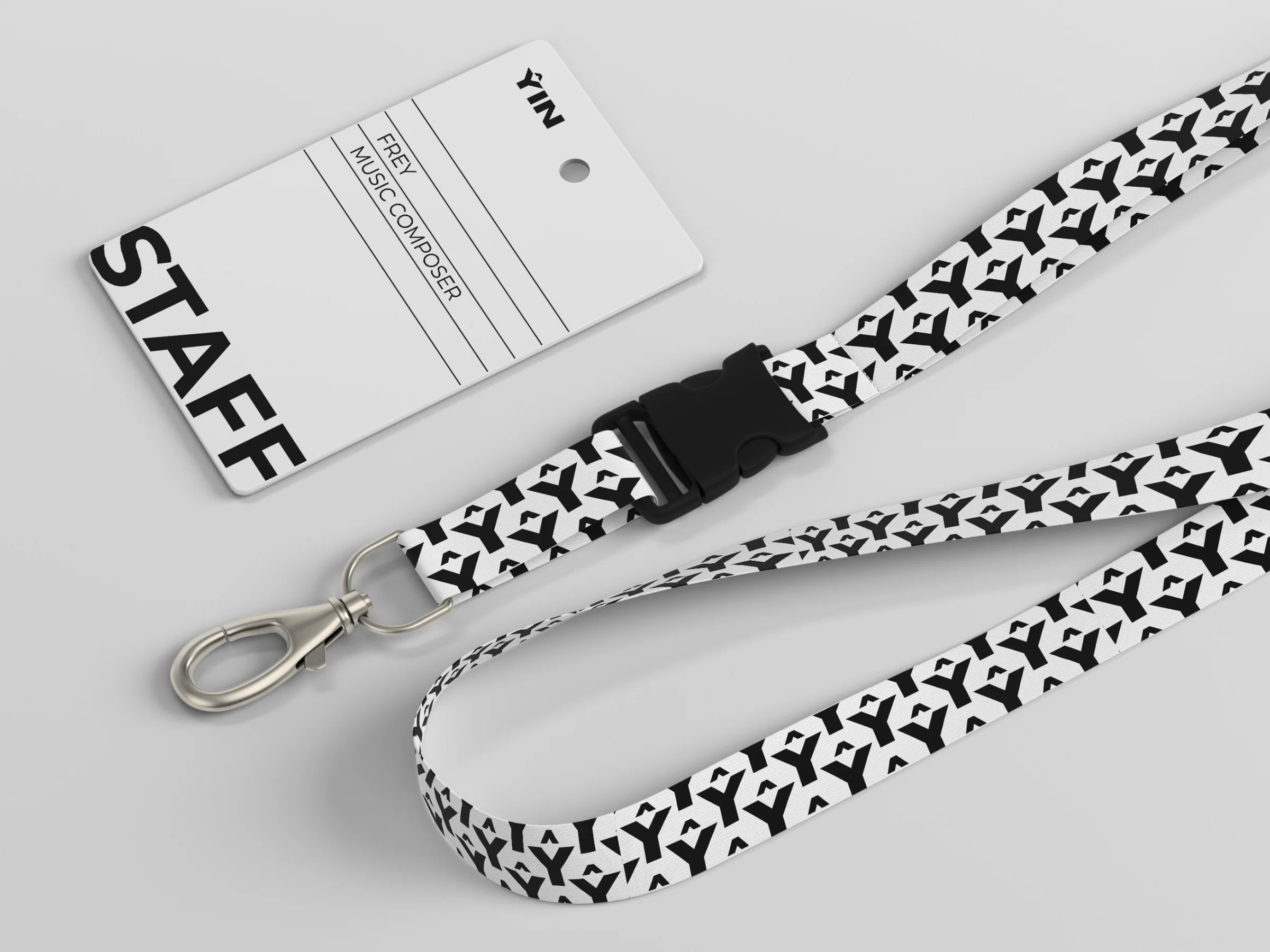
Client work • YIN — A branded lanyard that turns an operational item into a recognisable detail of the studio experience.
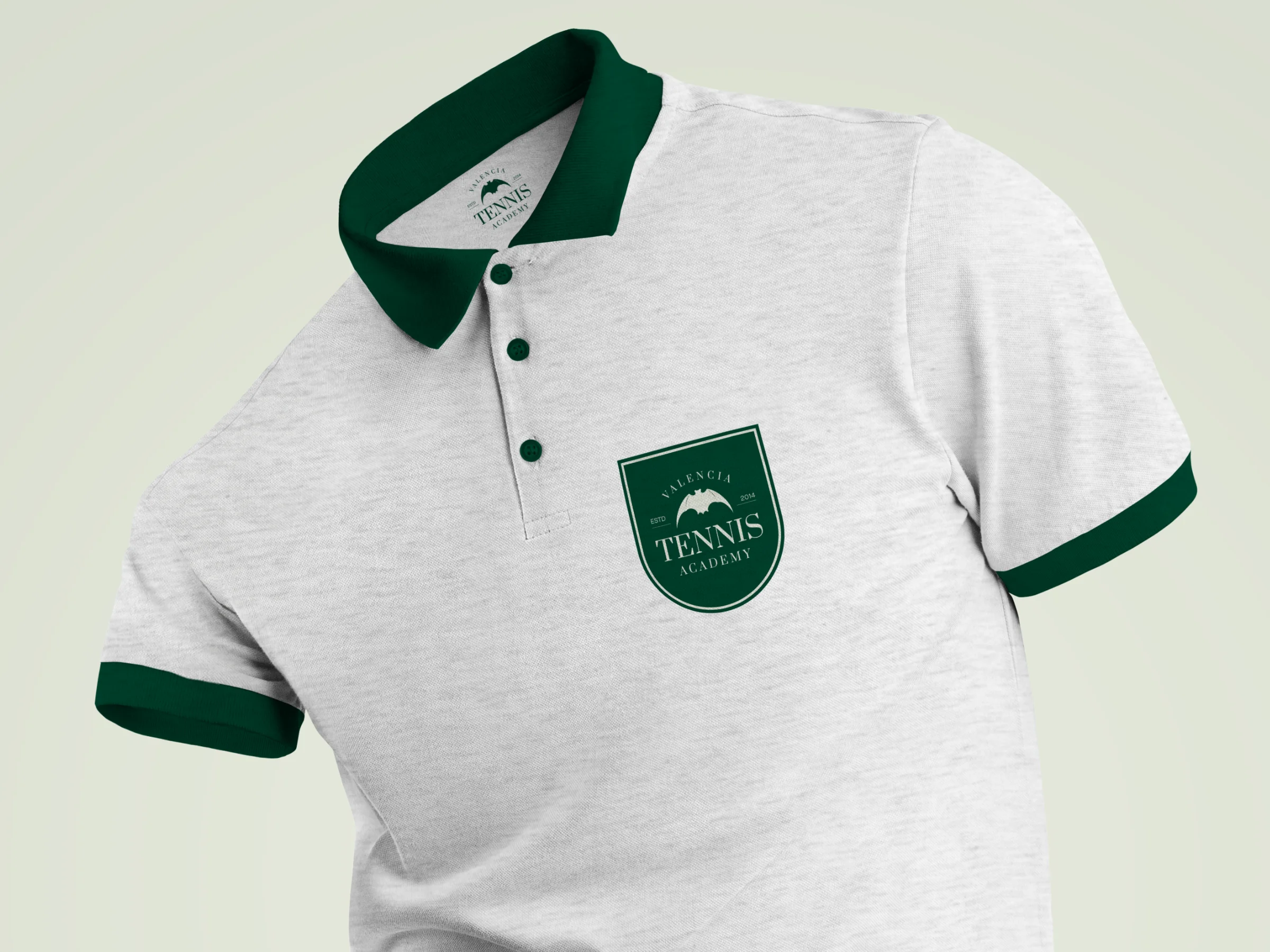
Client work • Valencia Tennis Academy — Apparel designed to make the academy look united, premium, and professional on court.
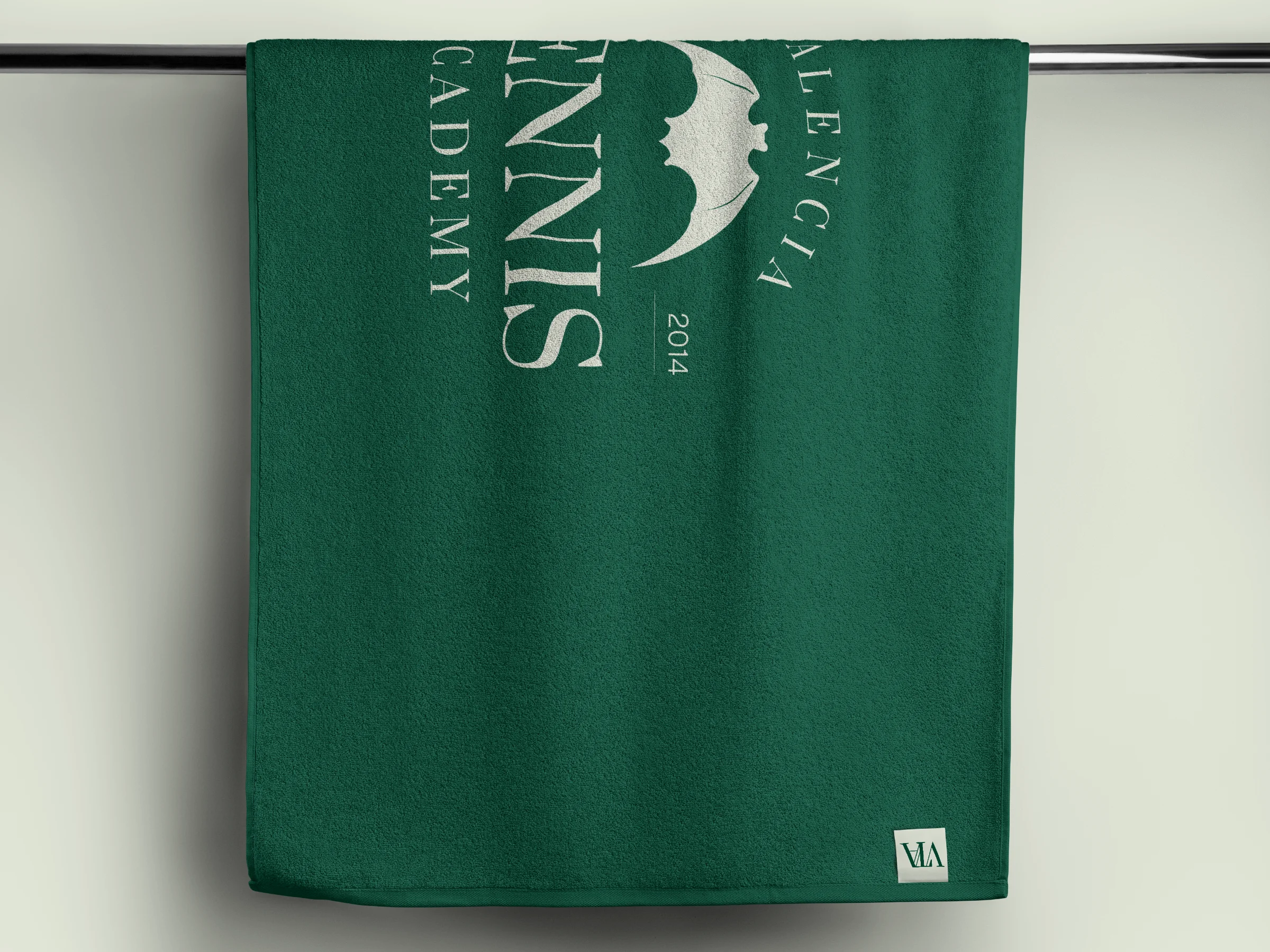
Client work • Valencia Tennis Academy — A practical textile piece that carries the identity beyond screens and into the everyday club experience.
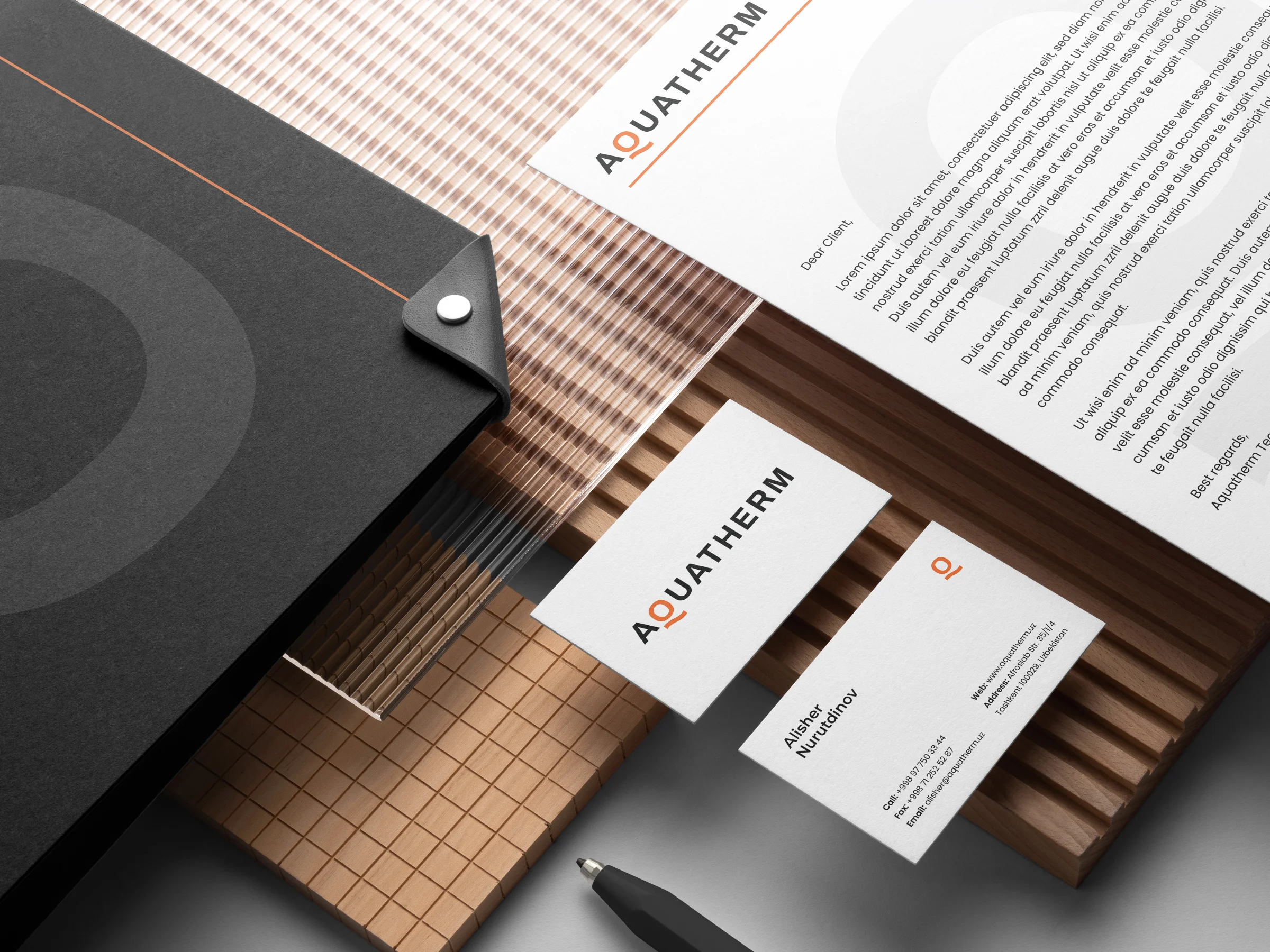
Client work • Aquatherm — Stationery that makes a specialist business feel organised, credible, and ready for serious projects.
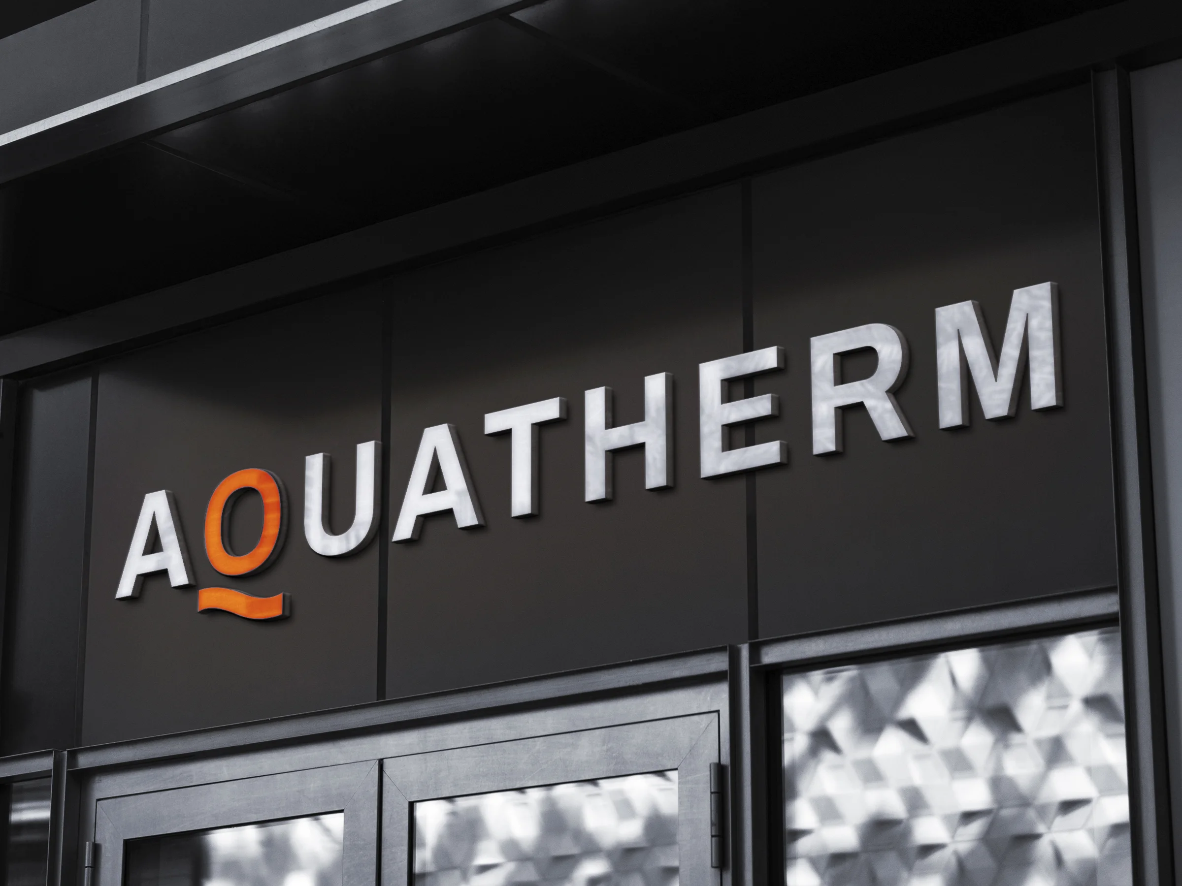
Client work • Aquatherm — A storefront concept that turns technical expertise into a clear, confident street-level presence.
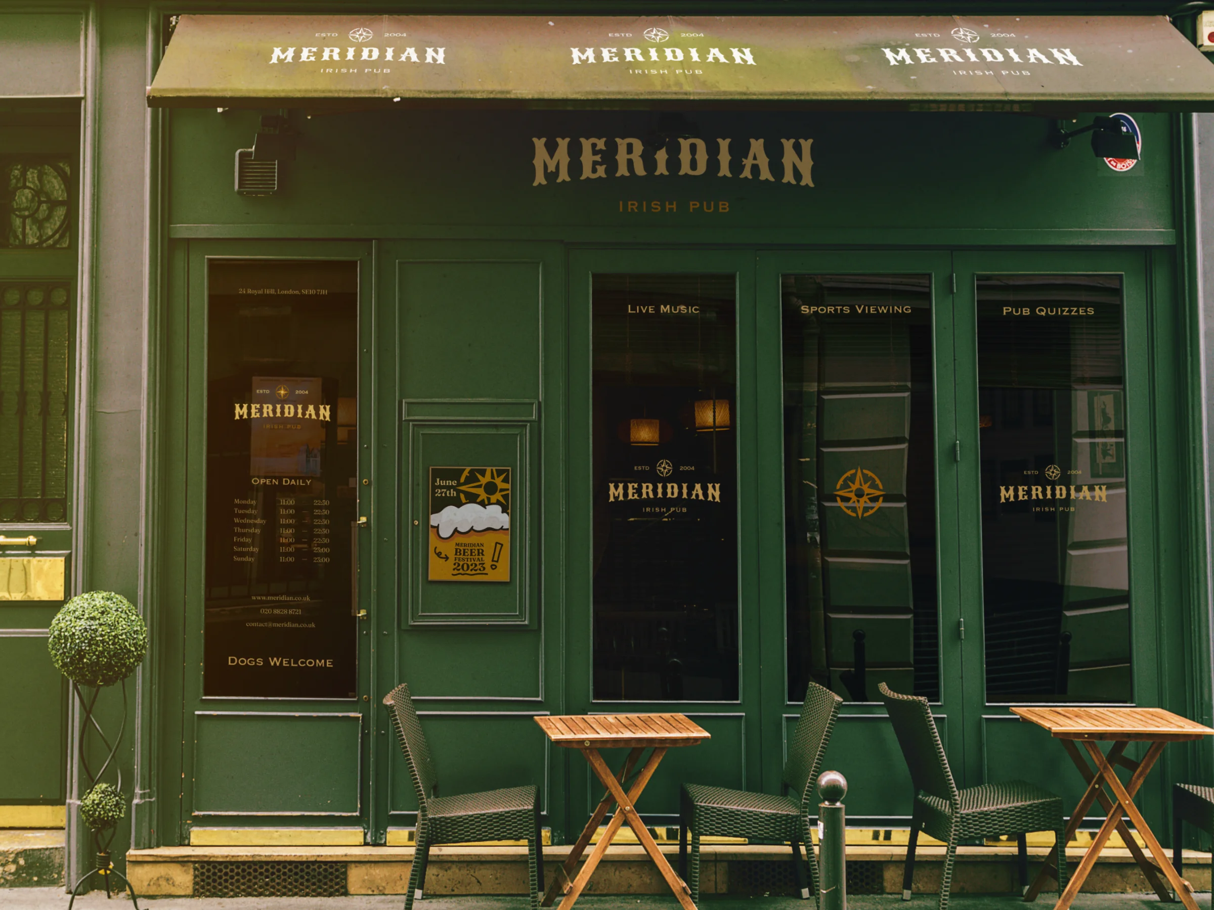
Client work • Meridian — A hospitality frontage designed to make the venue feel established, inviting, and memorable from the pavement.
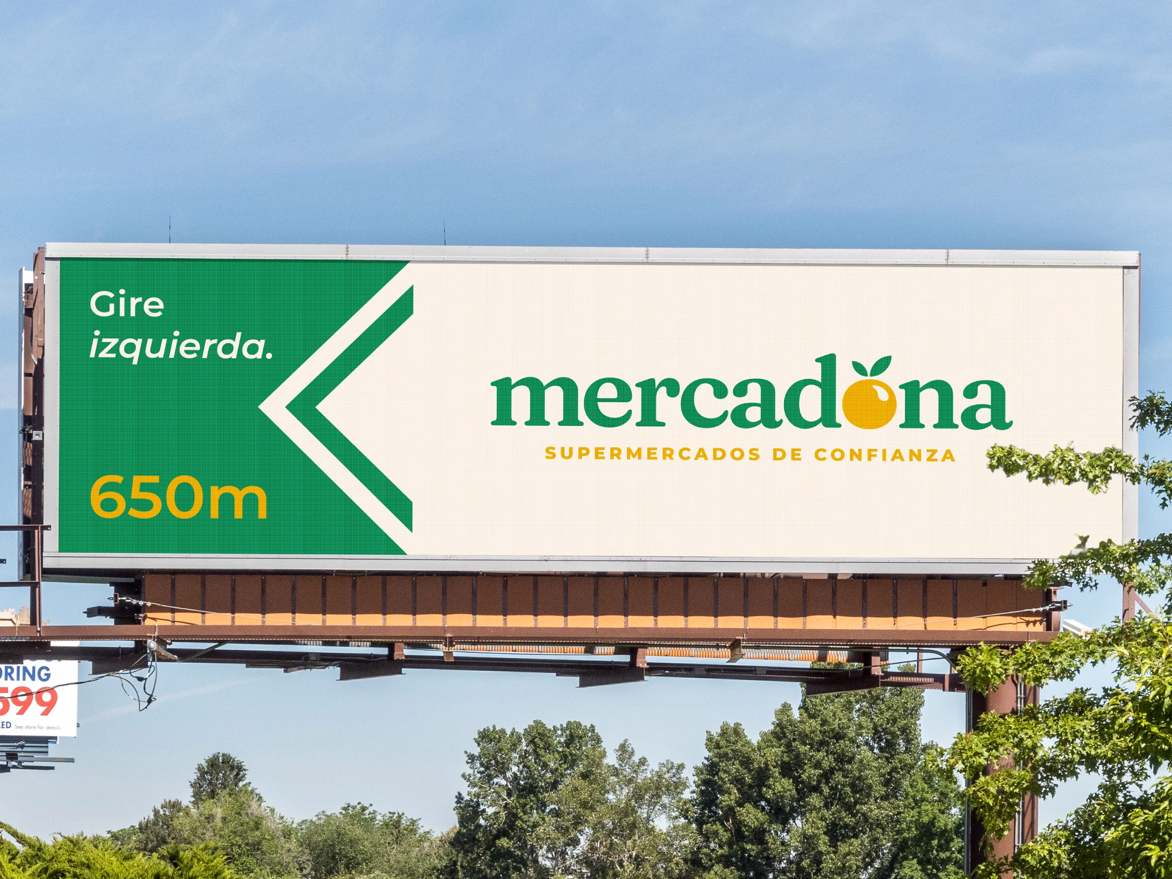
Passion project • Mercadona — A speculative refresh exploring how a familiar retail brand could feel sharper while staying recognisable.
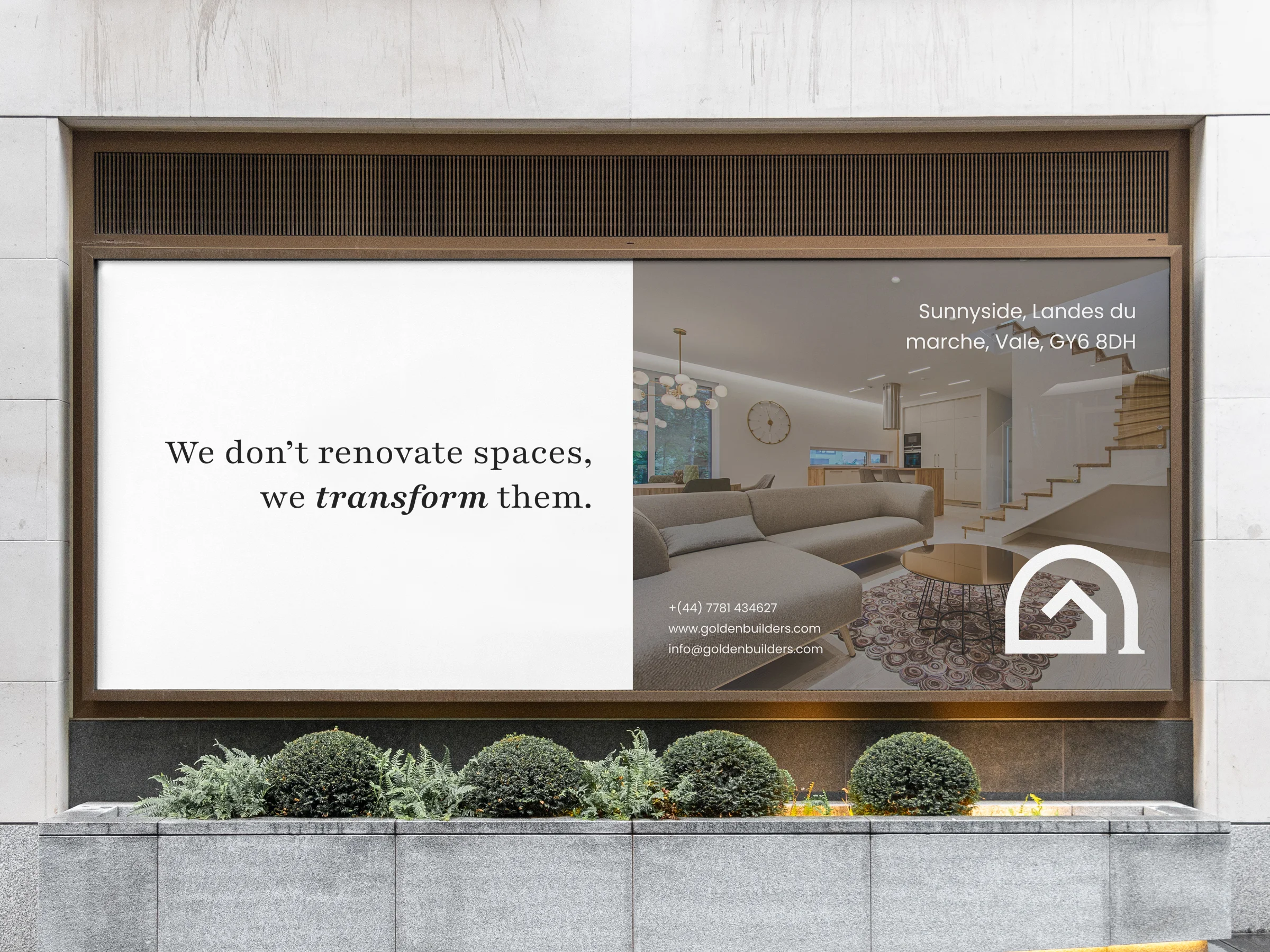
Client work • Golden Builders — A window campaign that turns a passing glance into immediate confidence in the quality of the work.
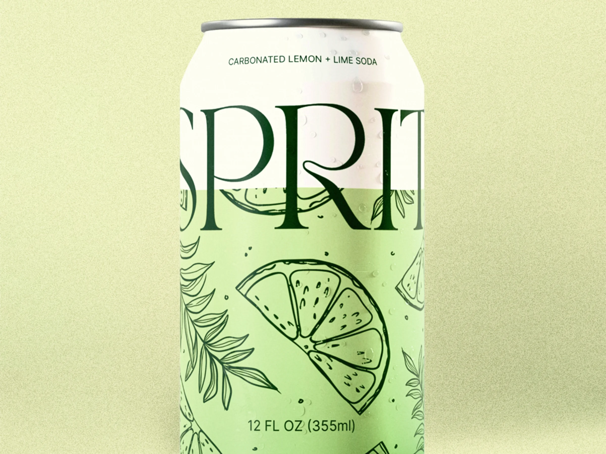
Passion project • Spark — Packaging exploration designed to make a simple drink feel fresh, contemporary, and impossible to overlook.
Get in touch