

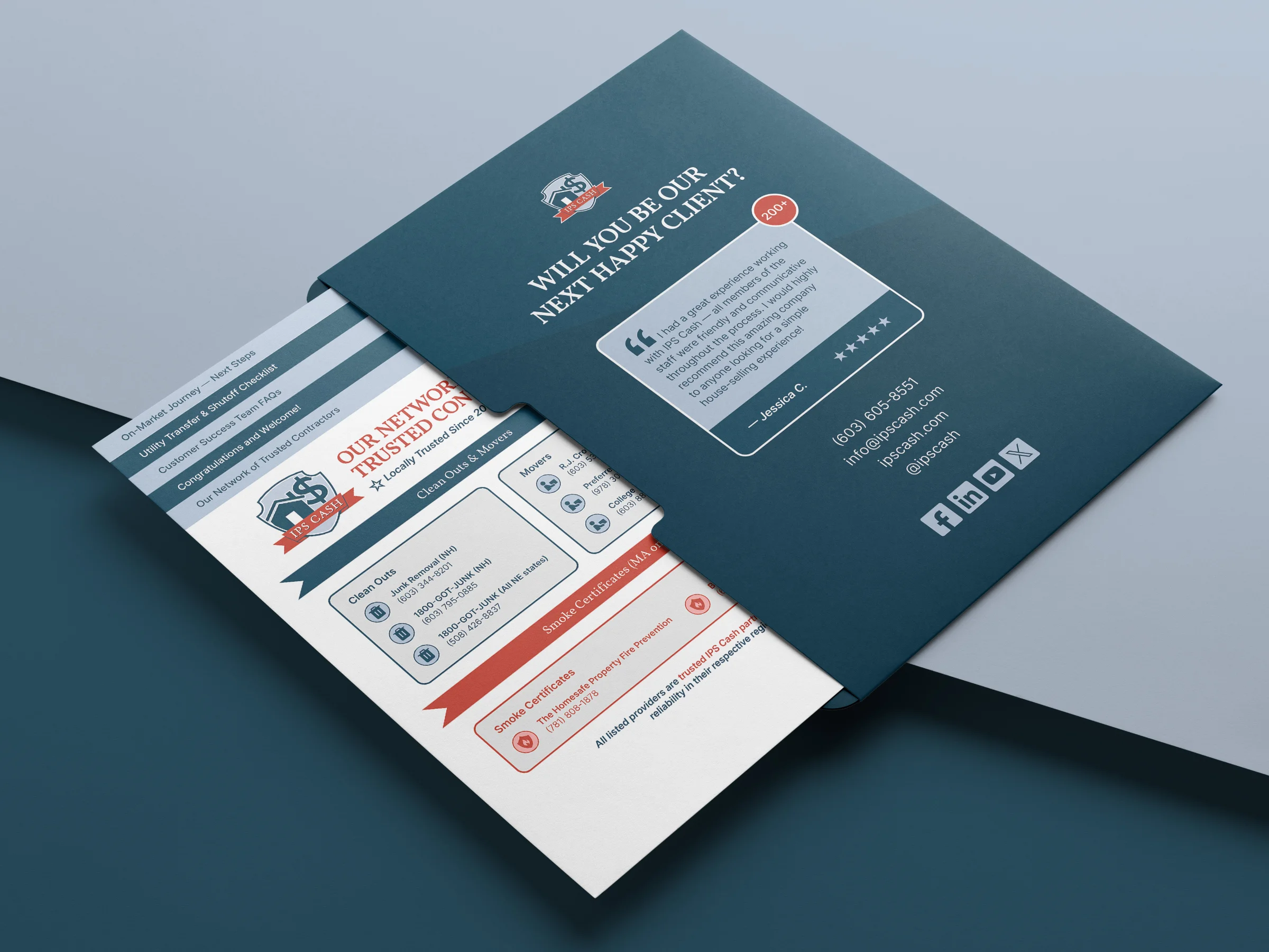
I designed a print marketing system centred around a premium presentation folder with structured inserts. The dark blue folder creates a strong, reliable first impression, while the white inserts keep the information clear and easy to read.
Each insert focuses on one topic, allowing sellers to go through the information at their own pace — from who IPS Cash are, to how the process works, common questions, and real customer reviews.
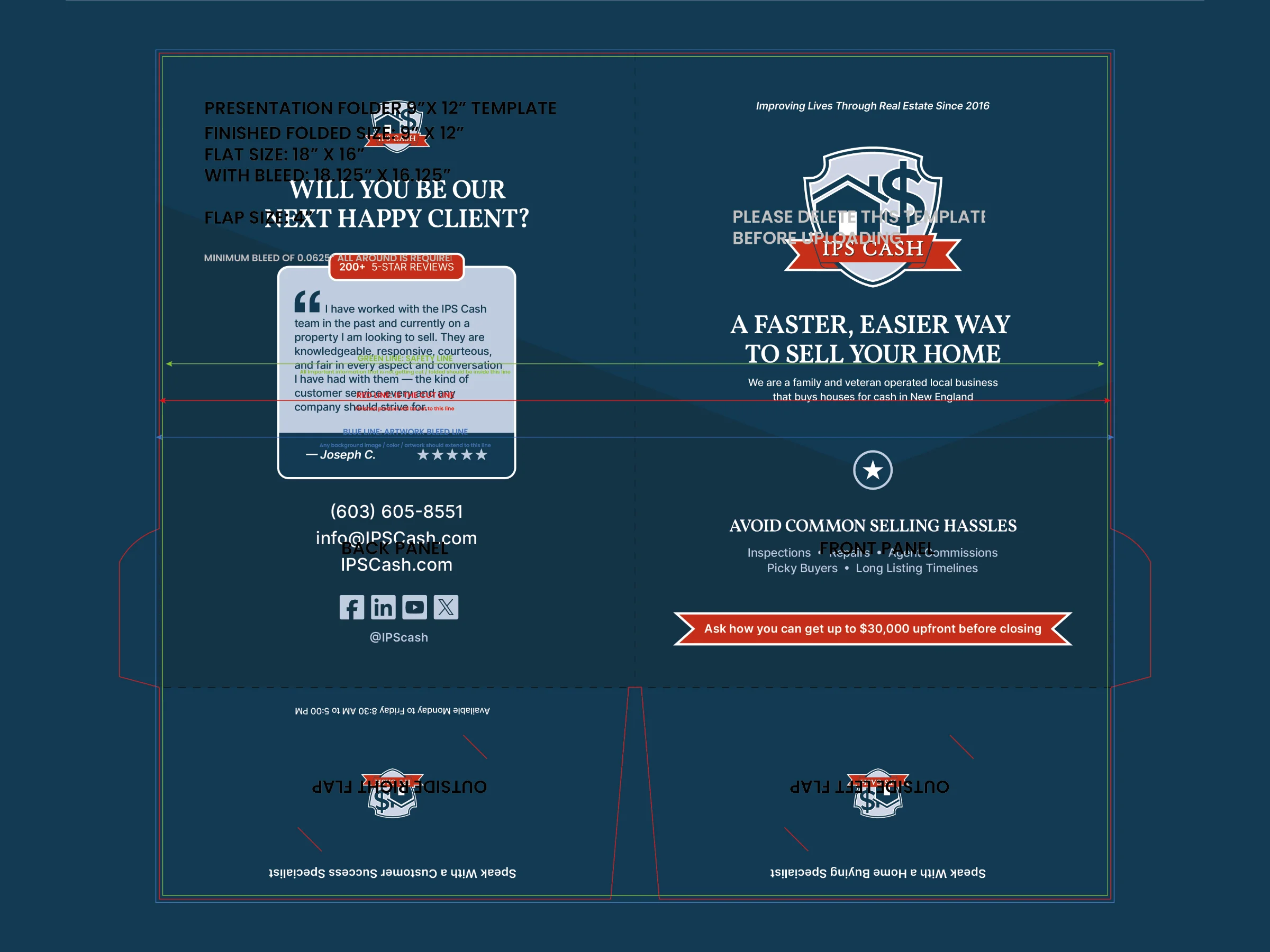
The folder was carefully structured. The left side holds four flyers, with die cuts on the bottom flap for the sales business card. The right side holds five flyers, with the bottom flap designed to hold a customer success business card.
The content was provided by IPS Cash and LoudMouse Marketing. I handled the layout, content structure, mockups, and print-ready files. The final result is a clear, flexible folder that supports face-to-face conversations and helps sellers feel confident choosing IPS Cash.
To keep all inserts feeling connected, I designed a consistent visual system that could be reused and adapted across pages. This allowed each piece to work well on its own while still feeling part of a single, cohesive set. The result is a system that stays visually engaging without becoming repetitive.


"Ren brought a clean, organised process from day one, made collaboration easy, and elevated our visuals in a way that immediately sharpened the brand. He was responsive, took feedback well, and delivered thoughtful improvements without losing momentum. I'd gladly work with him again and recommend him to any team looking to strengthen their marketing collateral or brand presence."

Candy Osborne | Chief Operating Officer