
No brand, no digital presence—just a vision.
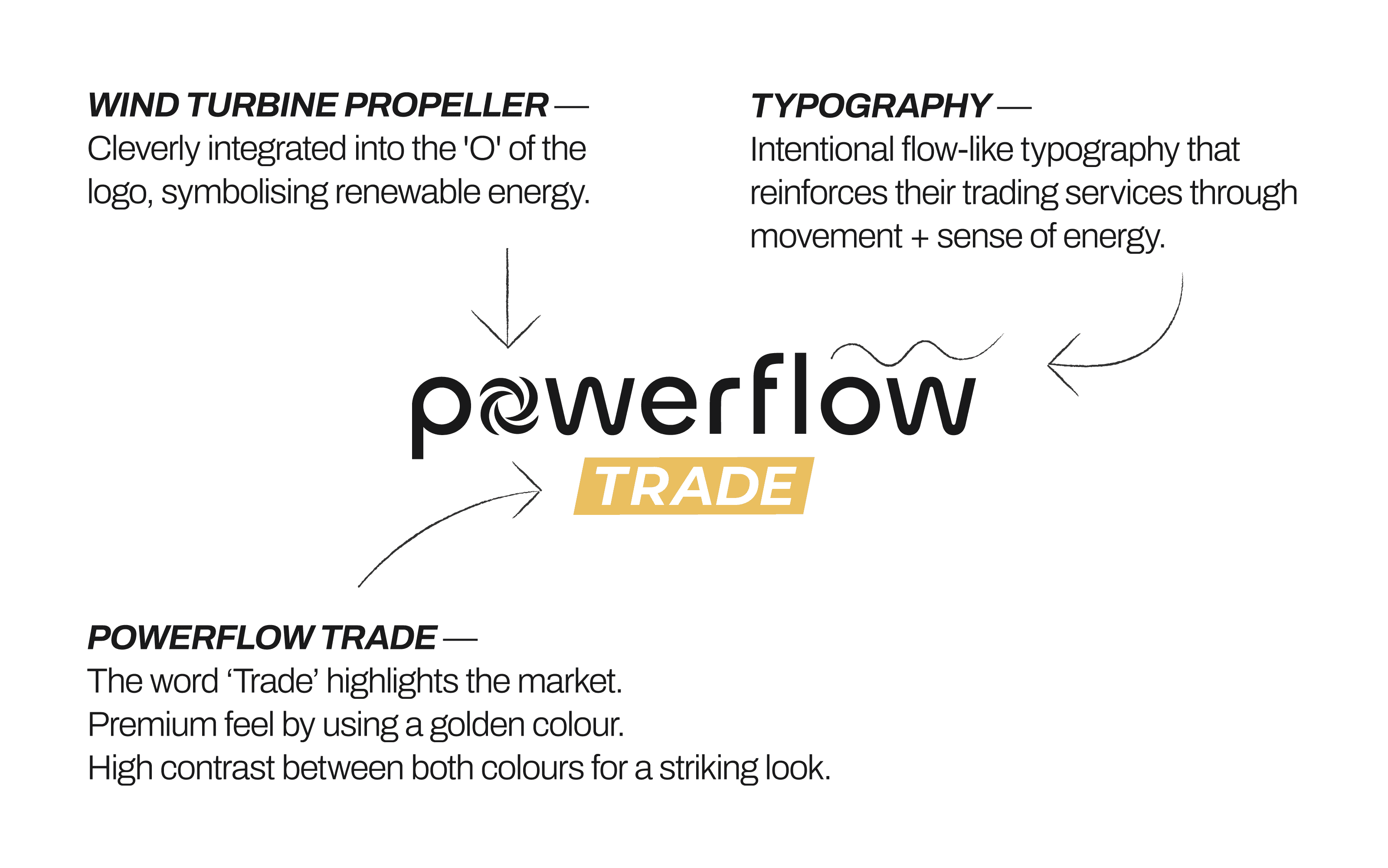
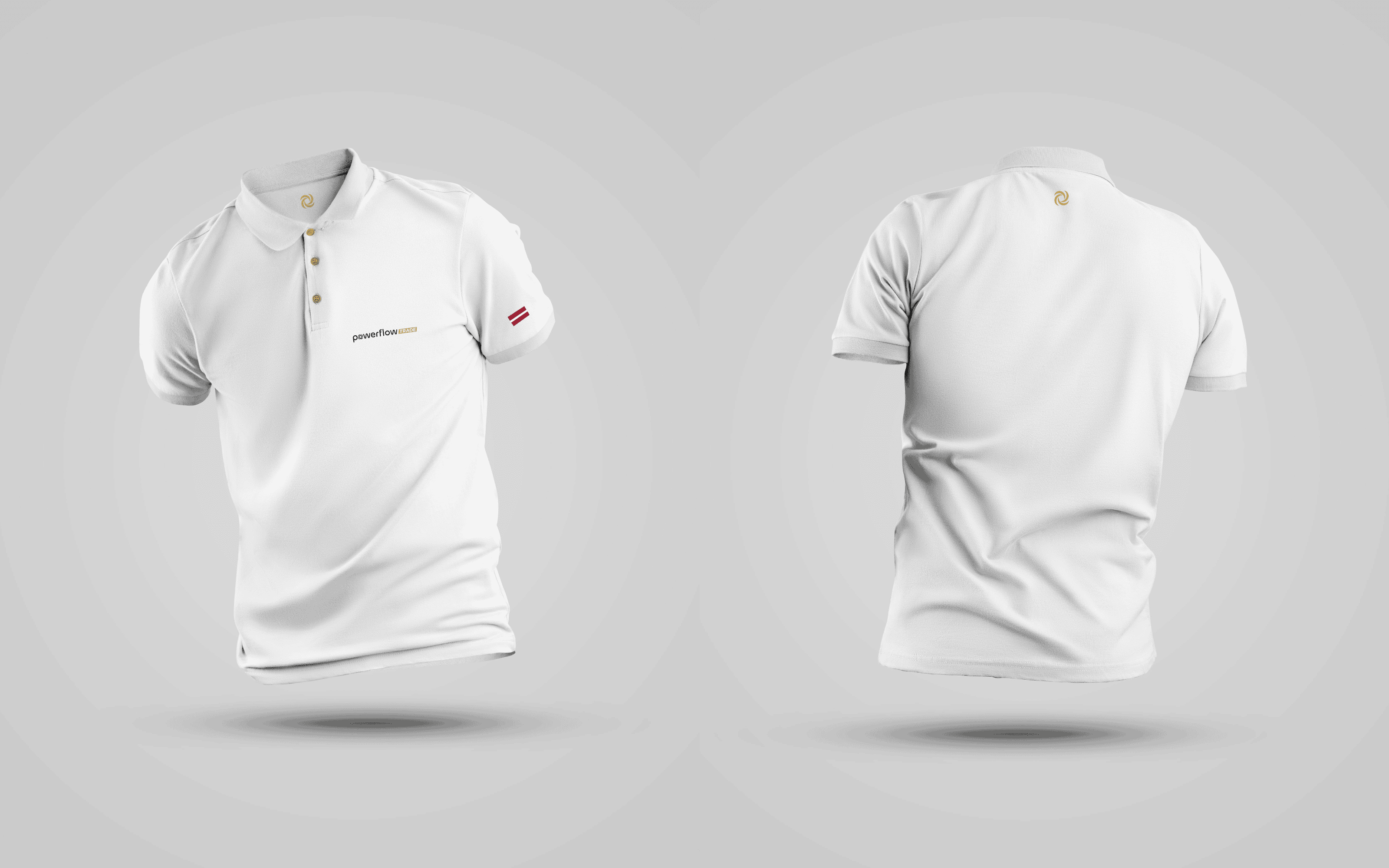
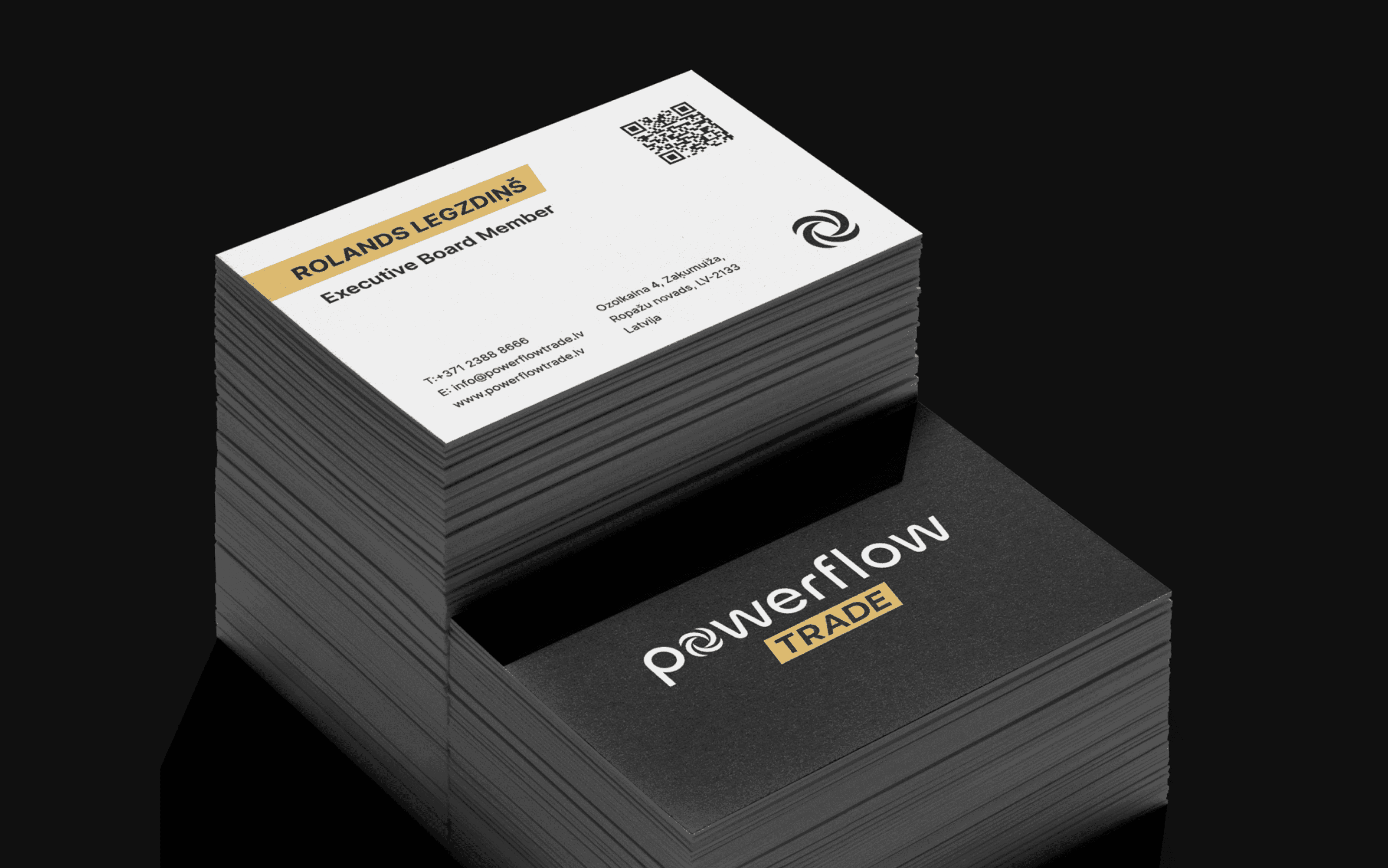
PowerFlow operates in a complex field, Al-driven energy trading in the Baltic region, where clarity and credibility are essential. With just a name and a vision, I partnered with Co-founder Rolands Legzdins to build a brand that feels modern, trustworthy, and something the team is proud of. We chose a clean, full wordmark as the most effective approach for a new company needing strong name recognition. Flow-inspired typography reinforces the brand name visually, while a wind turbine propeller integrated into the 'O' symbolizes renewable energy. This detail became a strong standalone logo mark, giving PowerFlow a distinct and memorable visual identity. The word 'Trade' is set in bold italic with a gold accent, communicating both premium positioning and the fast-paced nature of energy markets. Every element was intentionally designed to build trust and credibility at a glance.


Foundation for a Future-Focused Brand
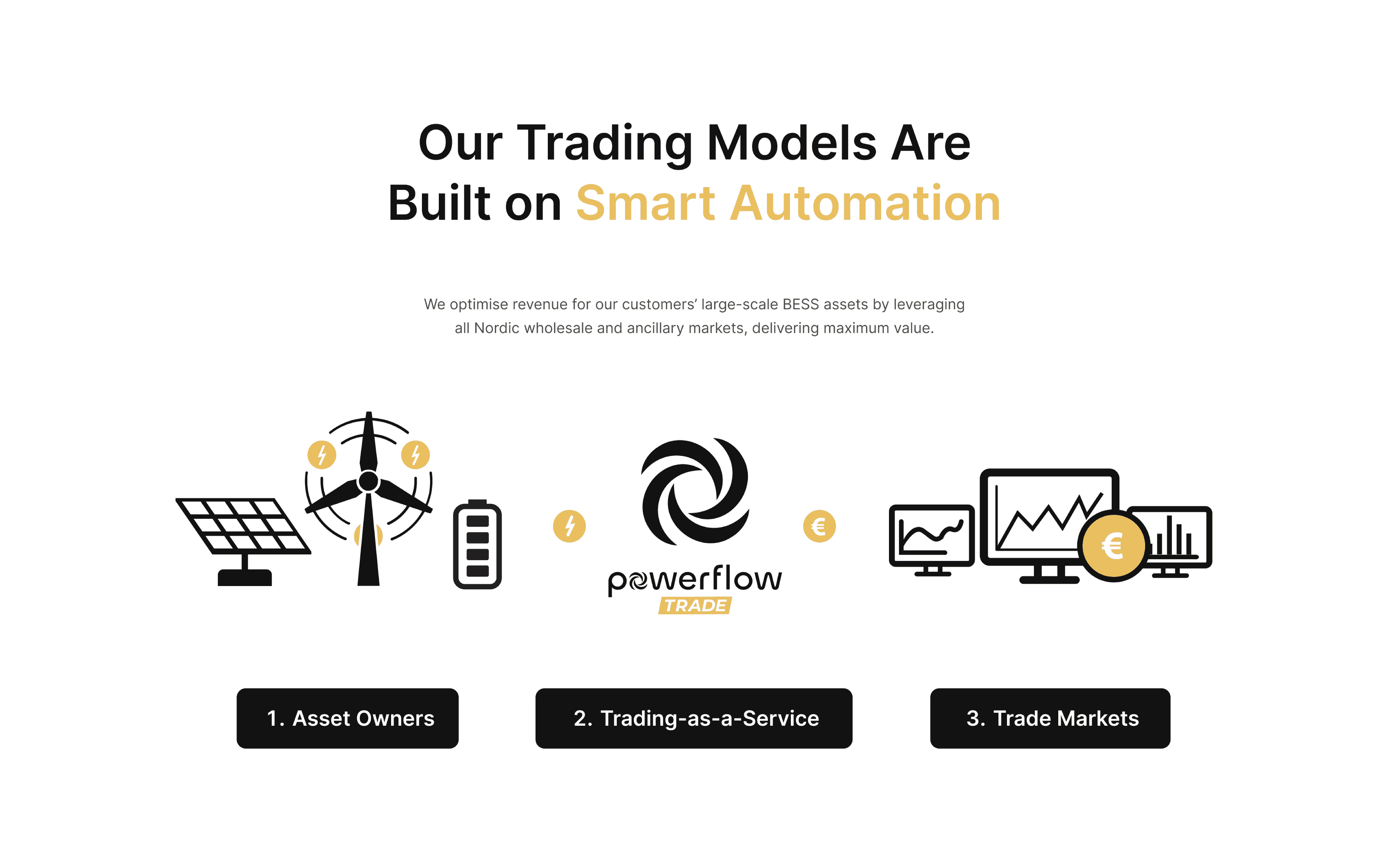
To reflect PowerFlow's vision and mission, I crafted a visual identity built around movement, clarity, and precision. Together with their team, we visualised their unique system in a three-step diagram: from asset owners, to trading-as-a-service, to trade markets — turning a complex service model into a clear and engaging narrative. The result is a brand that confidently communicates PowerFlow's value to investors and partners, while staying adaptable for future products and international expansion.
NEXT PROJECTS
(2018-25©)