From Fragmented to Powerful
BT Power had strong operations on the field but no brand to match. Their logo wasn't vectorised, fonts were inconsistent, and colours were chosen by eye — making consistency a constant struggle, especially for suppliers and internal teams. With no website or digital presence, they relied on word-of-mouth, which limited their growth as a B2B company. I took on the challenge of building a scalable identity from the ground up - something modern, rooted in their electrical background, and adaptable for both Latvian and international partners where communication relied on English. It needed to work across internal office use, vehicles, screens, and print — while feeling humble, professional, and trustworthy. Since the original logo idea was already deeply embedded and off-limits for change, and the client leaned towards a more corporate look, I shaped the system around those constraints, meeting them where they were and supporting them every step of the way for the future ahead.


A Brand That Matches the Momentum
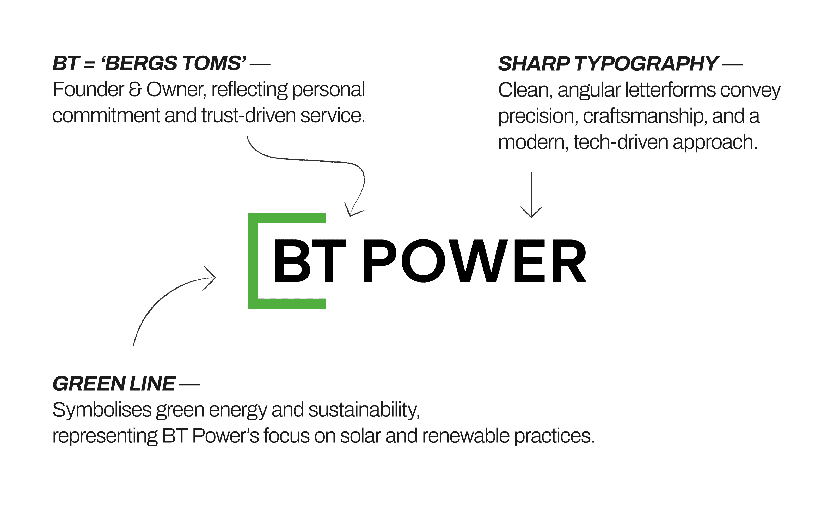
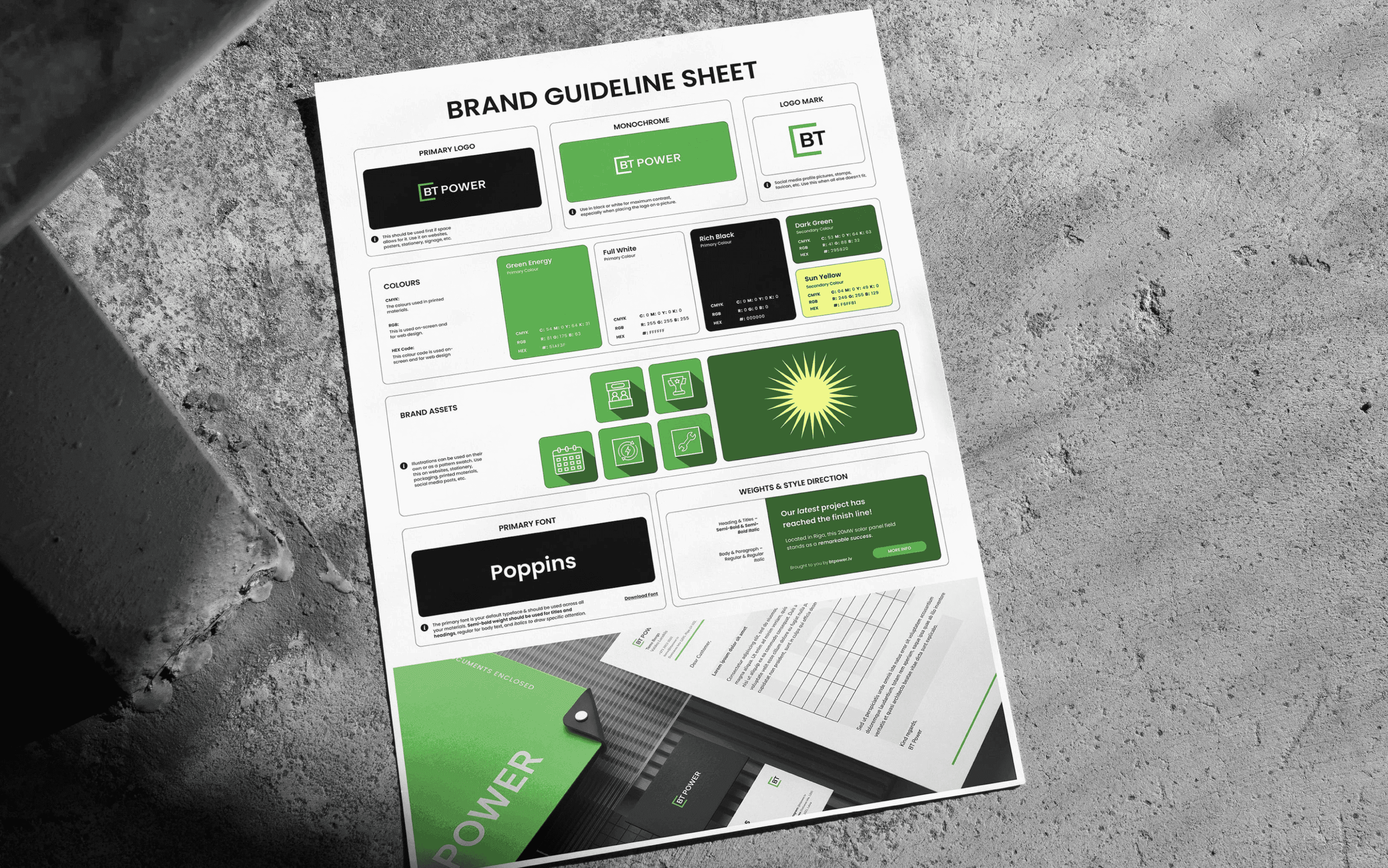
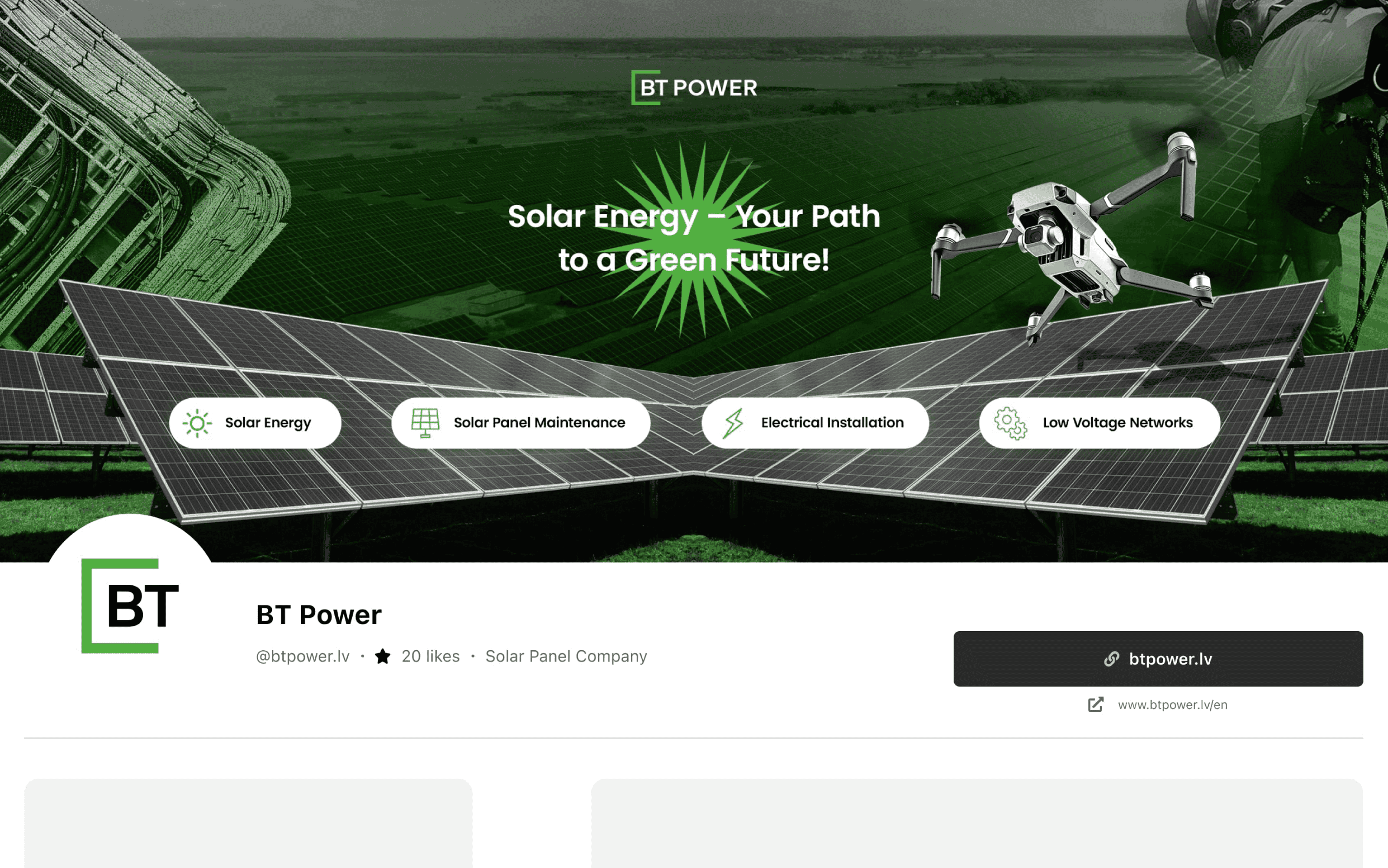
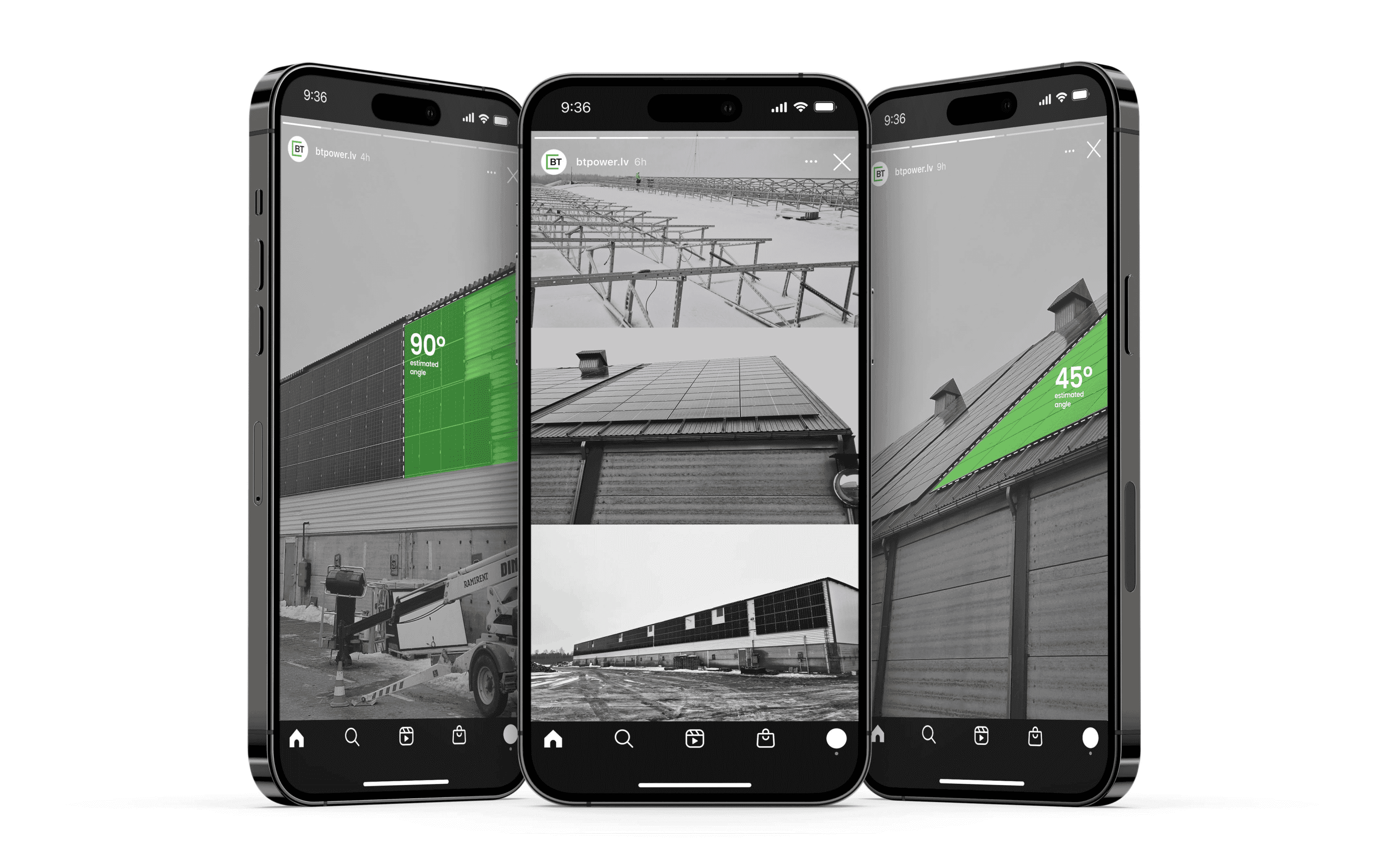
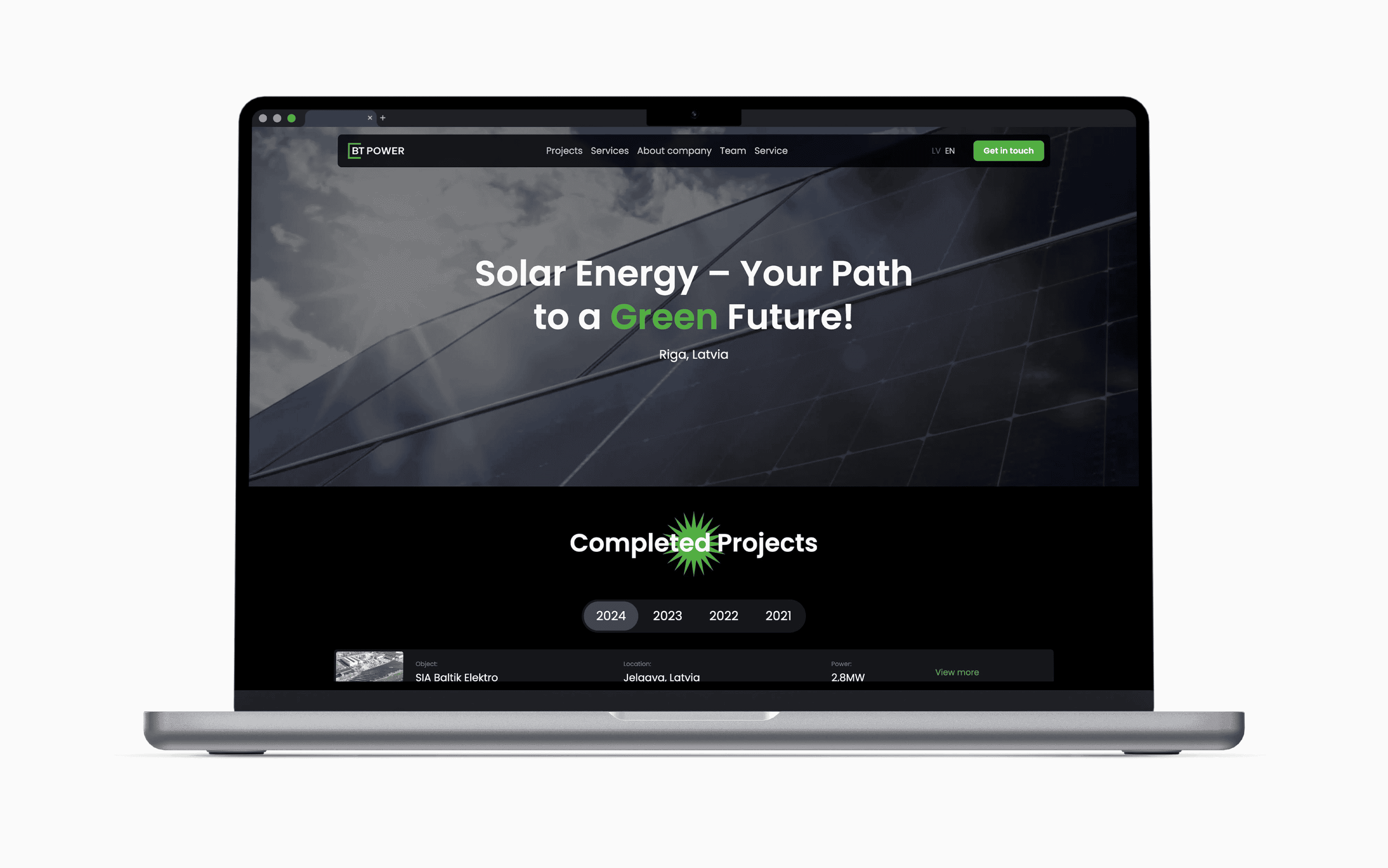
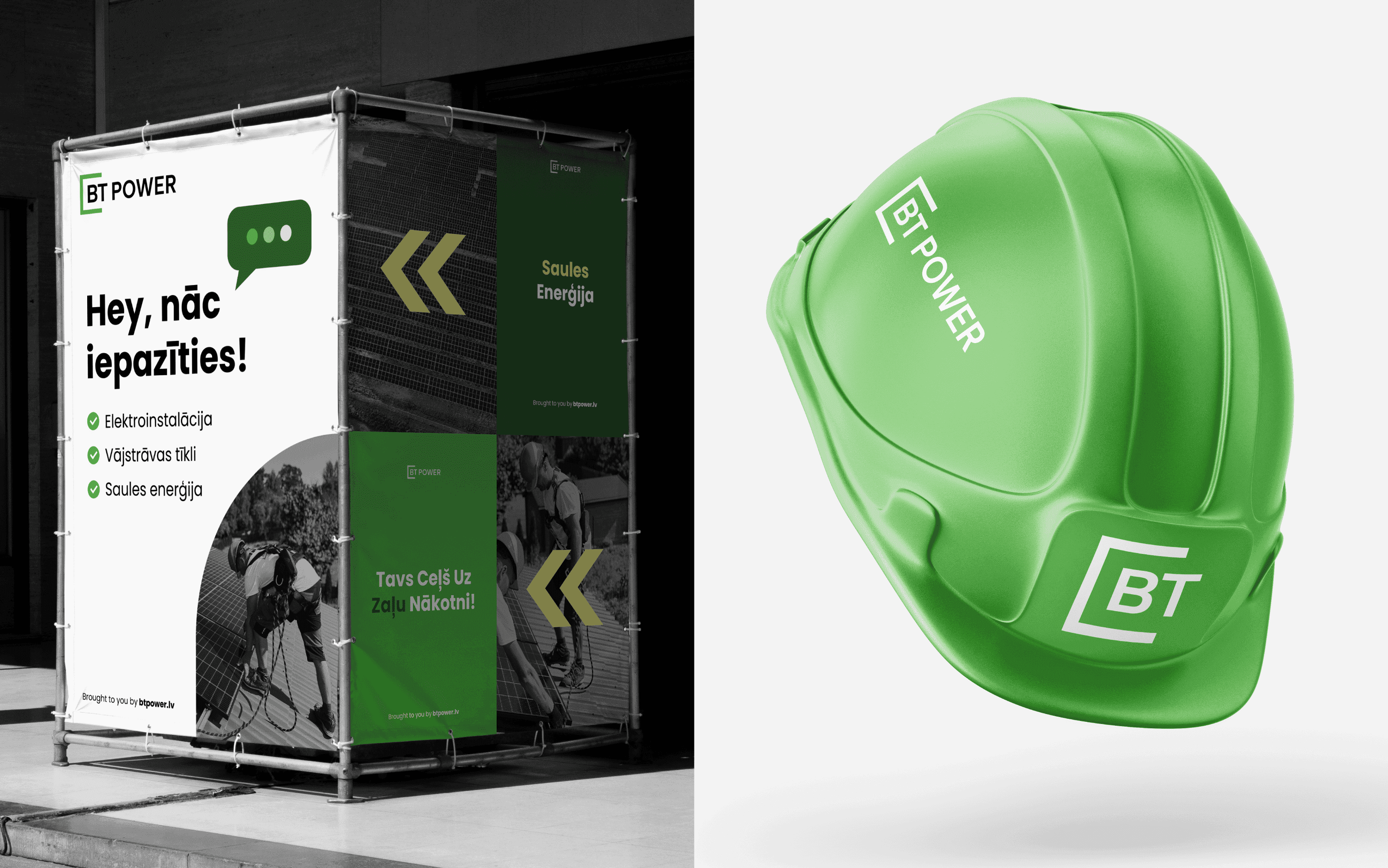
The concept centered on clarity with energy — building a bold, professional system that could grow with them. I refined and vectorised their original logo to retain familiarity while ensuring functionality. Poppins was chosen for its geometric clarity and Latvian character support "a,c,n". An energetic green made the brand stand out, a deeper green grounded the brand, while a bright yellow added contrast and memorability when needed to hint at solar power. The website was designed to communicate fast: who they are, what they do, and show off their solar fields. Since launch, BT Power climbed from 29th to 4th place in Latvia's Top 100 Fastest-Growing Companies (officially noted on lursoft.lv). Their identity now reflects their momentum — confident, cohesive, and built to stand the test of time. I even got told their partners are enquiring about their brand identity, so this has been a clear success.
NEXT PROJECTS
(2018-25©)